
App Store Optimization 2026: even the big apps have homework
Mike Rhodes | Founder and CEO, ConsultMyApp
6 October 2026 - UK and US
We took a look at 36 pretty common apps, their store listings, search results, custom product pages, events and thousands of customer reviews. There is plenty worth borrowing (not exhaustive, but enough to demonstrate a few key points). There are also a few things I wouldn't even include in screenshot 10 ;-)
There is a particular sort of ASO presentation where somebody puts Amazon, Nike or Duolingo on a slide and says, “This is what good looks like.” Everyone nods. The budget gets approved. Nobody asks whether the person searching for a pair of trainers has been shown anything about buying trainers.
I like looking at successful apps. They have the resources to try things, a lot of customers to learn from and, usually, very good people working on them. But success does not make every screenshot, keyword choice or product page the right answer for your app.
So, for this App Store Optimization 2026 study, we went looking properly. We used APPlyzer to collect UK and US listings across retail, finance, fitness, education, travel and sports or entertainment. We compared organic searches on iPhone and Google Play, examined real creative, read customer feedback and brought in our recorded Apple Search Ads auction stacks.
Some of the most useful improvements are already sitting inside the listing. They just need to be shown to the right person, a little earlier.
Start with the actual search
App store optimization is the work of helping the right people find your app, understand why it is useful and decide to download it. Then the product has to deliver. Otherwise you have spent quite a lot of effort arranging a disappointing first date.
For me, the useful unit of analysis is a person trying to do something in a particular store and country. “Fitness” is a category. Tracking a run, counting macros and getting back to sleep are three different jobs. Giving them the same creative brief is asking rather a lot of one screenshot.
Our search sample deliberately includes both category terms and tasks: clothes shopping, selling clothes, sending money abroad, learning Spanish, sleep sounds and booking a hotel. We kept the store and country separate throughout. Here is why.
Same brand and query, different store
App | Search | Country | iPhone organic position | Google Play organic position |
Amazon Shopping | shopping apps | US | 12 | 1 |
eBay | shopping apps | US | 11 | 2 |
SHEIN | clothes shopping | UK | 37 | 6 |
Nike Shopping | buy trainers | UK | 12 | 1 |
Temu | shopping deals | US | 31 | 7 |
Monzo | mobile banking | UK | 17 | 3 |
Wise | send money abroad | UK | 4 | 1 |
Source: APPlyzer organic search snapshots, collected 6 October 2026. Positions are within returned results for these selected queries. Country-specific app identities were matched before comparison.
These are large, familiar brands. Yet their positions can differ considerably between stores for the same search. A Google Play result does not tell you what the iPhone customer will see. Nor does an app's position on “shopping apps” describe its entire organic performance.
I would use this table to ask better questions, rather than announce that somebody has failed ASO. Does the weaker store need different metadata? Is its audience searching differently? Are the results dominated by specialists? Which useful task could we explain more convincingly?
Prioritise terms using demand, relevance, competitive results and the value of the customer you can serve. APPlyzer returns search-demand scores and estimated daily impressions. Those are estimates, and queries can overlap, so adding every keyword's estimated impressions together will not produce your future install total. Sadly, the spreadsheet does not make that promise binding.
Metadata is still doing work
Apple identifies text relevance in the app title, subtitle, keyword field and primary category, alongside user behaviour such as downloads, ratings and reviews, as search factors. It also says promotional text does not affect search ranking. Those are useful distinctions when someone suggests putting the same keyword in every available box. Apple's search guidance explains the details.
Google Play gives you a title, short description and full description rather than Apple's separate keyword field. Treat the two stores as separate writing jobs. A clear, accurate description of the product comes before finding another place to squeeze “best”. Google's listing guidance sets out the fields and limits.
A title and subtitle are only part of the picture. Apple also provides a separate keyword field, so a phrase missing from the title can still be relevant to the app’s search strategy.
We collected the text history as well as the current listing. Across our 36 brands, 23 had an observed change to title, subtitle or short-description wording during the period. Eighteen had title or subtitle wording changes specifically. That does not prove they were running ASO experiments. It does show that these fields are being rewritten even at well-established apps.
What changed in the recorded metadata
App and store | First recorded change | What we observed |
Nike, UK Google Play | 14 March; 14 June | Sneakers and clothing wording entered the title in March; a broader athlete proposition followed in June. |
SHEIN, iPhone | 7 February US; 11 February UK | The subtitle moved from a money-saving proposition to fashion for everyone. |
Duolingo, UK iPhone | 17 April | The subtitle moved from listing several subjects to explicitly mentioning Spanish and maths. |
MyFitnessPal, US Google Play | 11 February; 15 April | The short description shifted towards calorie and macro tracking; later wording dropped the AI emphasis. |
Wise, US iPhone | 28 July | Money-transfer wording entered the title, with international-payment wording in the subtitle. |
Source: APPlyzer metadata history, 1 January–5 October 2026. Dates show when wording was first observed; descriptions here are paraphrased.
For Duolingo, we checked the UK iPhone rank history for “learn spanish” around that April subtitle change. It was already number one and stayed there across all 29 returned daily observations. There was nowhere higher to go. The change might still help people understand the offer, but this result gives us no reason to claim it improved that keyword's organic rank.
The wider check is useful too. MyFitnessPal stayed at number two for “calorie counter” across both US Google Play rewrite periods examined. SHEIN’s typical middle position for “clothes shopping” improved from 35 to 32 in the UK comparison, while its US position stayed at five. A change in wording and a change in ranking happening around the same time do not show that one caused the other.
That is why I would keep a dated change log, choose the intended outcome before rewriting and check several relevant queries afterwards. Record campaigns, releases and other changes too. A before-and-after line on a chart cannot tell you which of three things happening that week deserves the credit.
Show the useful bit earlier
When reviewing screenshots, I ask what somebody learns from the first few frames, then read the rest of the sequence. Apple says up to three screenshots or app previews may appear in search, depending on platform and orientation. The opening is useful real estate, although there is no universal law saying exactly three frames decide every download.
Duolingo's US sequence makes free language learning and short, enjoyable lessons immediately understandable. The third frame introduces chess. That is perfectly sensible for a product offering several subjects. For a person looking specifically to learn Spanish, though, the owl has brought a chessboard to a language lesson.
The conversation example is already there, in frame five. I would test moving that demonstration into the opening for language intent, keeping the broader sequence for people exploring the whole product. This is an order and audience question, not an accusation that Duolingo forgot to show speaking practice.
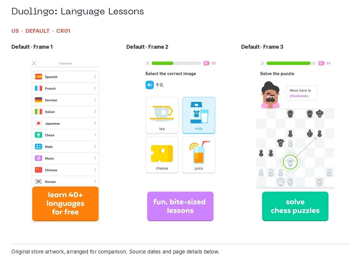
Duolingo: Language Lessons, US, default; collected 2026-10-06. Original app artwork, arranged for comparison.
Babbel gives us a good positive example. Its opening connects easy learning, speaking straight away and short lessons created by experts, with visible product demonstrations. It tells you what you will do without requiring a tour of every feature. Rosetta Stone makes its lifetime pricing proposition and time commitment conspicuous. Different approaches, both easy to understand.
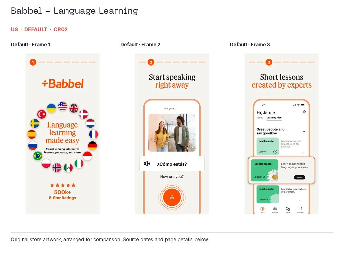
Babbel - Language Learning, US, default; collected 2026-10-06. Original app artwork, arranged for comparison.
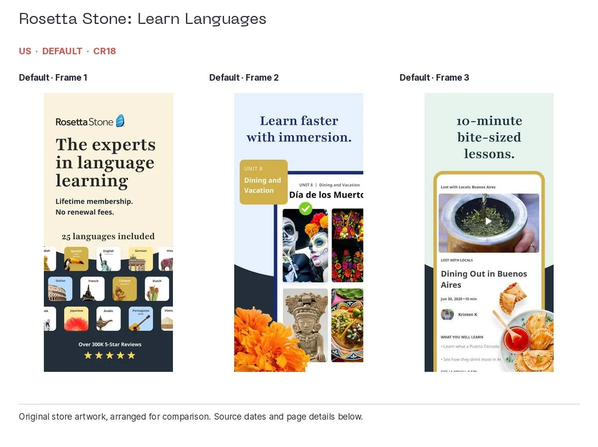
Rosetta Stone: Learn Languages, US, default; associated search: language learning; collected 2026-10-06. Original app artwork, arranged for comparison.
Amazon's UK opening is clear about price and range. Big captions, recognisable products and consistent colour make it readable. But the first two frames could largely be advertising Amazon the retailer. The app starts explaining itself more clearly in frame three.
Again, the useful material is already available. Tracking appears in frame four, price-drop information in frame six and visual search in frame eight. For the relevant audience, I would test one of those earlier. Amazon probably does not need another person to tell it that customers like low prices. Showing what the app helps them do is the more interesting brief.
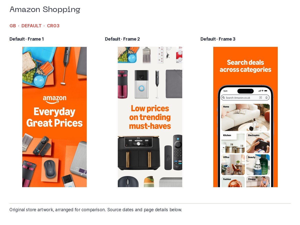
Amazon Shopping, UK, default; collected 2026-10-06. Original app artwork, arranged for comparison.
eBay illustrates why localisation goes beyond changing the spelling. Its UK opening moves through new and pre-loved shopping, auctions and deals. The US sequence introduces shopping, Live collectibles and selling car parts. These are noticeably different stories from the same marketplace.
Both use real features and clear use cases. The question is which story should lead for a particular visitor. Someone selling clothes, someone buying collectibles and someone finding a replacement car part do not need quite the same introduction.
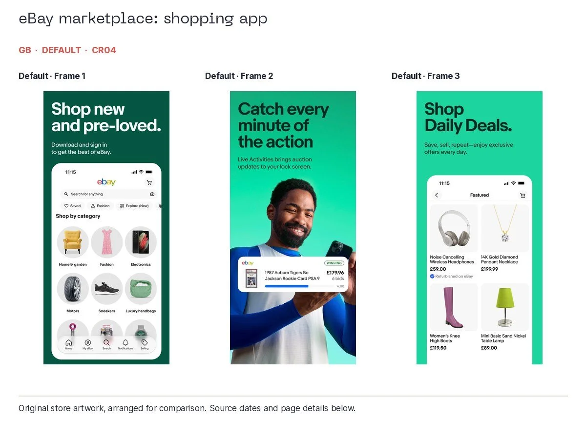
eBay marketplace: shopping app, UK, default; collected 2026-10-06. Original app artwork, arranged for comparison.
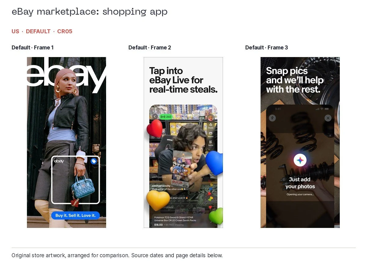
eBay marketplace: shopping app, US, default; associated search: shopping apps; collected 2026-10-06. Original app artwork, arranged for comparison.
The same question travels well across categories. Monzo's UK opening shows personal banking, business banking and a children's account. Each frame gives a concrete benefit, and the children's frame includes age and guardian information. For a personal-account search, though, two of those opening slots belong to other audiences. I would compare separate personal, business and parent routes using the strong material already available.
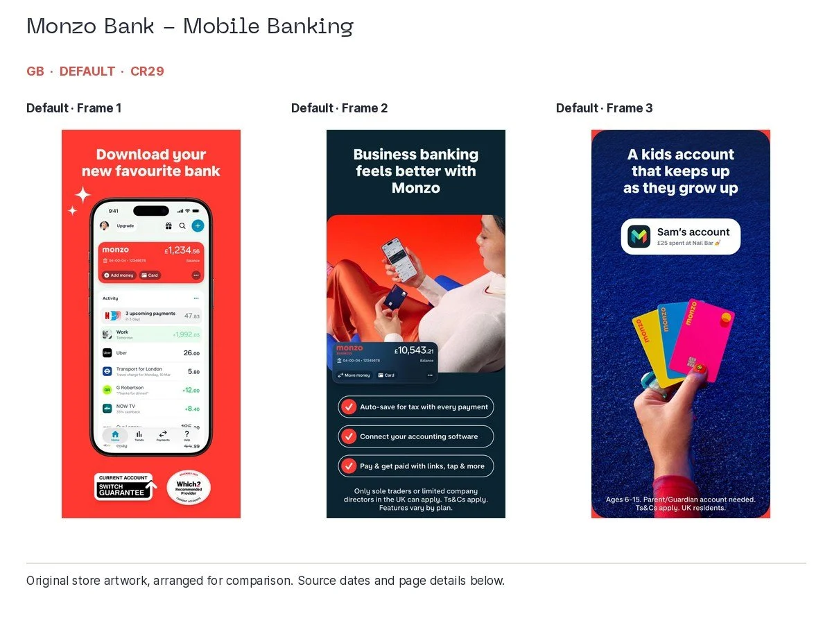
Monzo Bank - Mobile Banking, UK, default; collected 2026-10-06. Original app artwork, arranged for comparison.
MyFitnessPal gives us a positive fitness example: scanning food and voice logging are demonstrated with short captions and visible entries. These are understandable ways to reduce the work of keeping a food diary. Check feature and plan availability before putting that promise in front of somebody. The screenshot cannot tell us scan accuracy or whether every visitor gets the feature for free.
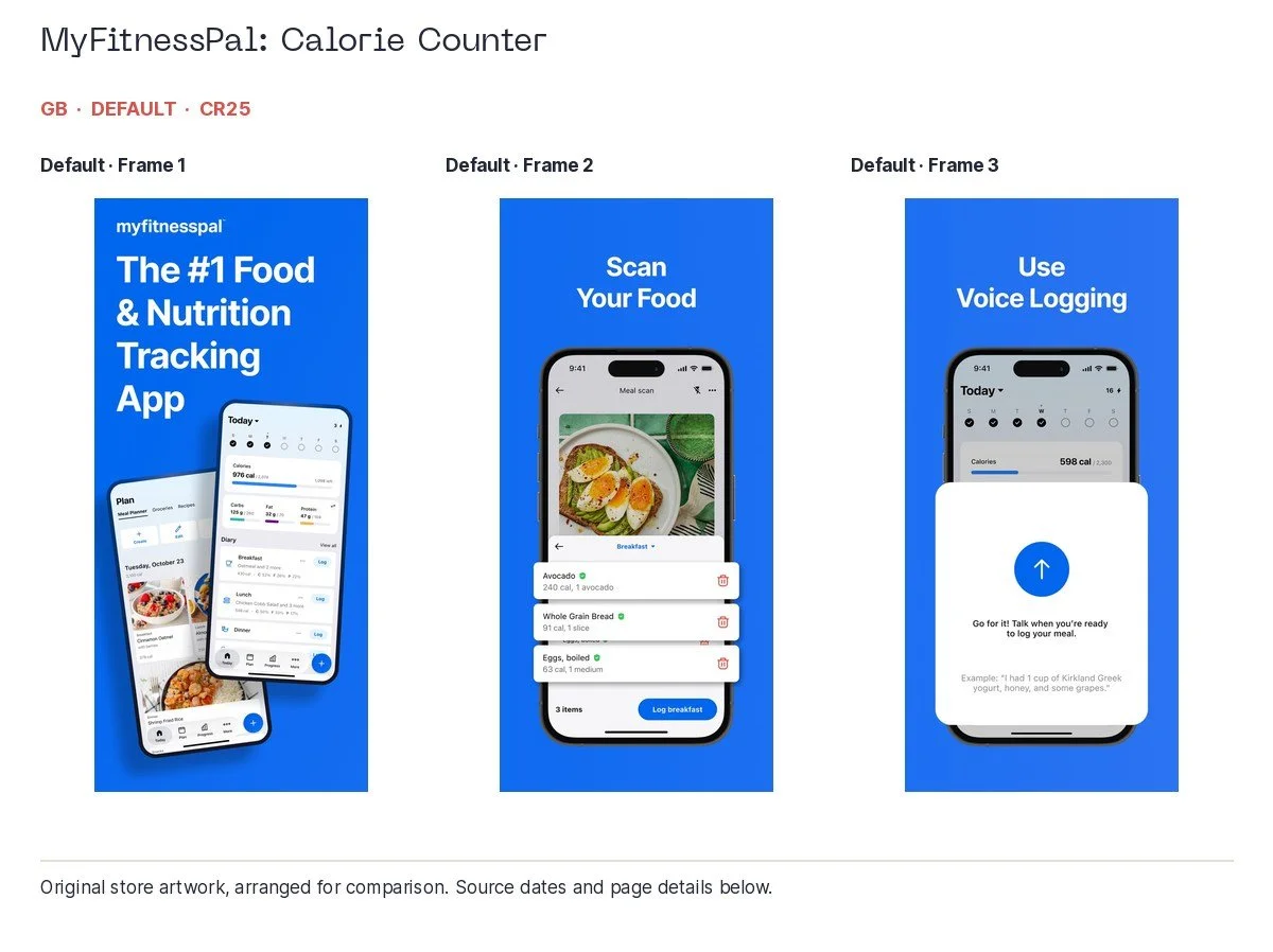
MyFitnessPal: Calorie Counter, UK, default; collected 2026-10-06. Original app artwork, arranged for comparison.
Booking.com's UK sequence shows hotel search and an app-exclusive deal before moving into car hire. The pounds and visible price make the benefit specific. For hotel-only intent, I would test keeping the third frame on accommodation. Airbnb similarly has clear proof for homes and experiences; those are useful candidates for separate routes when the searches justify them.
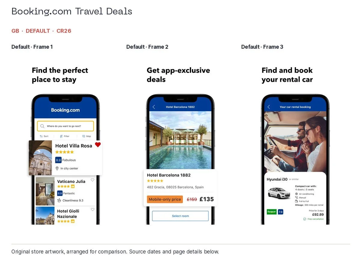
Booking.com Travel Deals, UK, default; collected 2026-10-06. Original app artwork, arranged for comparison.
For sports, Premier League and ESPN both use an opening panorama across two frames, then show match or score information in the third. The emotion and brand identity are clear. A live-score visitor could reasonably get the score screen earlier. A fantasy visitor needs actual fantasy utility, rather than a Fantasy tab doing all the explaining. Netflix's broad discovery story brings in clips, podcasts and games; a film-only search could use a narrower opening.
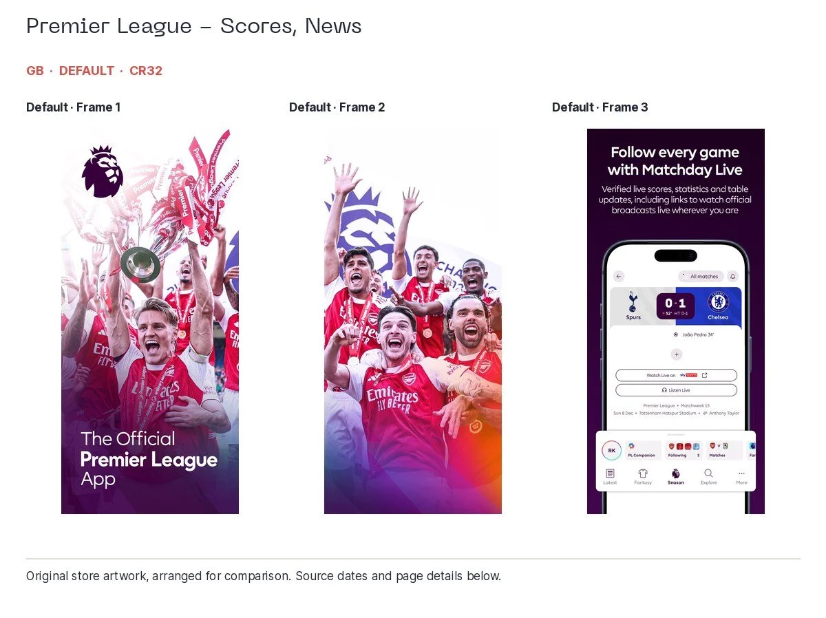
Premier League - Scores, News, UK, default; collected 2026-10-06. Original app artwork, arranged for comparison.
Google Play feature graphics deserve their own look. Our six-brand comparison includes UI-led learning and booking examples, logo-led treatments and content-led artwork. A feature graphic can help explain a task or reinforce an established identity. Review how it appears on the relevant Play surface and device before deciding which job it should do.
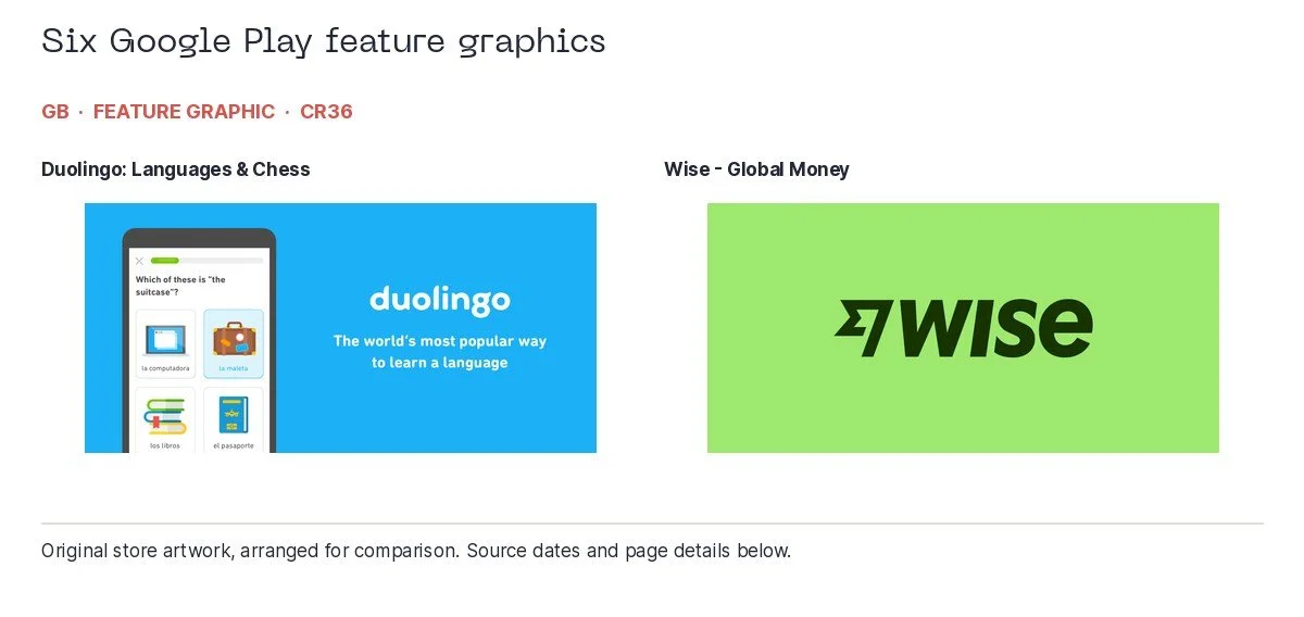
Duolingo: Languages & Chess, UK, feature graphic; collected 2026-10-06 | Wise - Global Money, UK, feature graphic; collected 2026-10-06. Original app artwork, arranged for comparison.
A CPP needs a reason
A custom product page, or CPP, is an additional version of an iPhone or iPad app's product page, with its own URL and a different treatment of features or content. Apple currently allows up to 70. They can be used with Apple Ads, shared through other channels and assigned to selected keywords in organic search. That last part makes the connection between search intent and creative rather more useful. Apple's CPP guidance has the current rules.
The page should make its audience obvious. If you cannot say why somebody gets this page instead of the default, you may have created more work without giving the customer much in return.
These examples show both ends of that problem. A Pimsleur page associated with “learn spanish” leads with a Spanish-specific conversation-coaching proposition. That is a clear response to the query. The relevant language and feature are visible immediately.
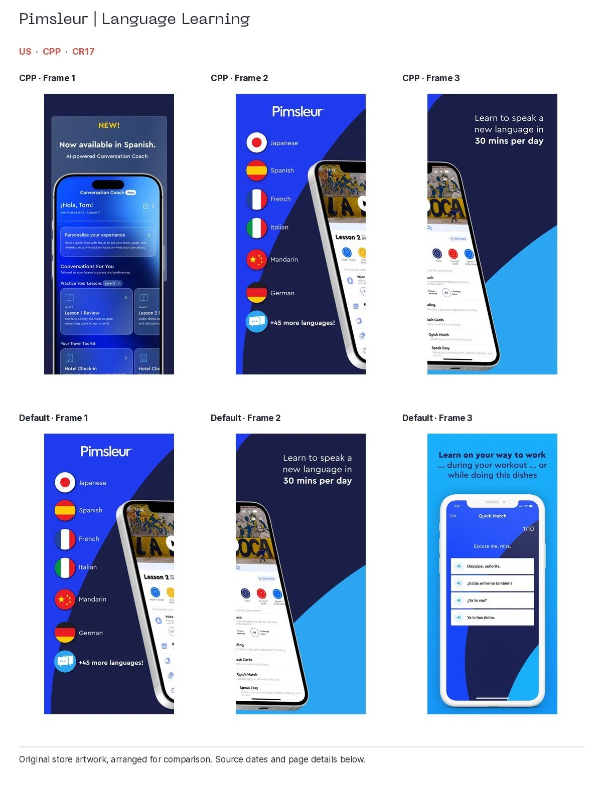
Pimsleur | Language Learning, US, cpp; associated search: learn spanish; page observed during the preceding 90 days; collected 2026-10-06 | Pimsleur | Language Learning, US, default; associated search: learn spanish; collected 2026-10-06. Original app artwork, arranged for comparison.
A Busuu page returned for the same US search opens with general language learning, then student-life tools, including a Japanese proficiency example. It is attractive and coherent for a student audience. The third frame does show Spanish options. I would make that relevant proof more prominent for someone explicitly asking for Spanish.
I would check how the page is assigned and test Spanish-specific proof earlier. Match the opening to the intended audience before judging whether the page is doing its job.
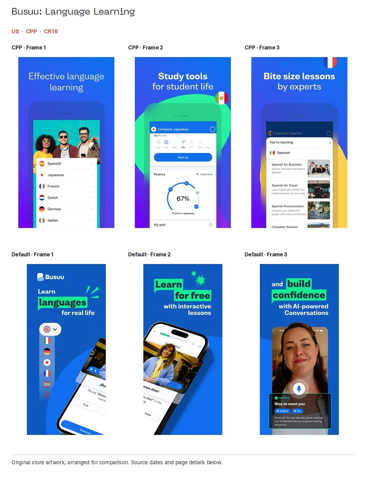
Busuu: Language Learning, US, cpp; associated search: learn spanish; page observed during the preceding 90 days; collected 2026-10-06 | Busuu: Language Learning, US, default; associated search: learn english; collected 2026-10-06. Original app artwork, arranged for comparison.
Temu's captured US clothing-related page uses an offer first, followed by seasonal clothing and home or kitchen products. The qualification on the offer is visible. It has a recognisable promotional purpose, but the opening leaves room for a more specific clothing story. A different page ID is not, by itself, a different answer to the search.
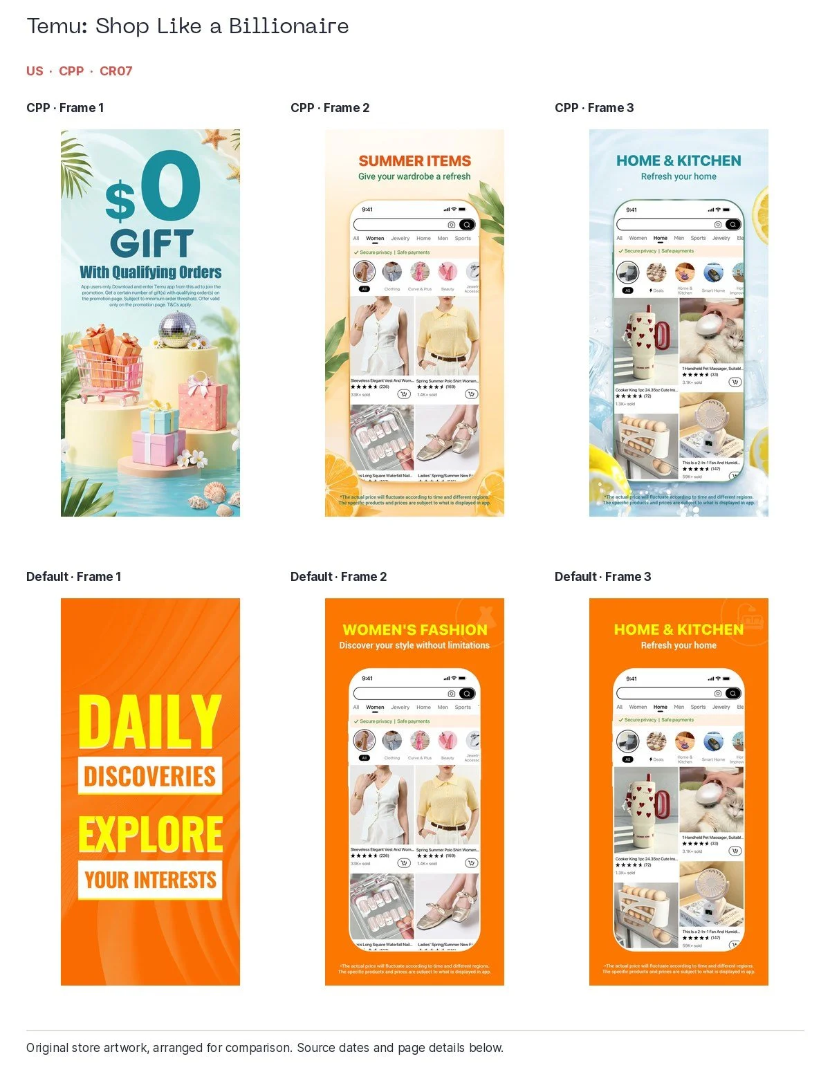
Temu: Shop Like a Billionaire, US, cpp; associated search: shopping apps; page observed during the preceding 90 days; collected 2026-10-06 | Temu: Shop Like a Billionaire, US, default; associated search: shopping apps; collected 2026-10-06. Original app artwork, arranged for comparison.
Monzo shows what useful tailoring looks like. Its captured UK personal-account and savings pages each stay with their own audience, unlike the broad default opening that moves through personal, business and children's accounts. Clear product proof is already present; the custom page gives it a more focused introduction.
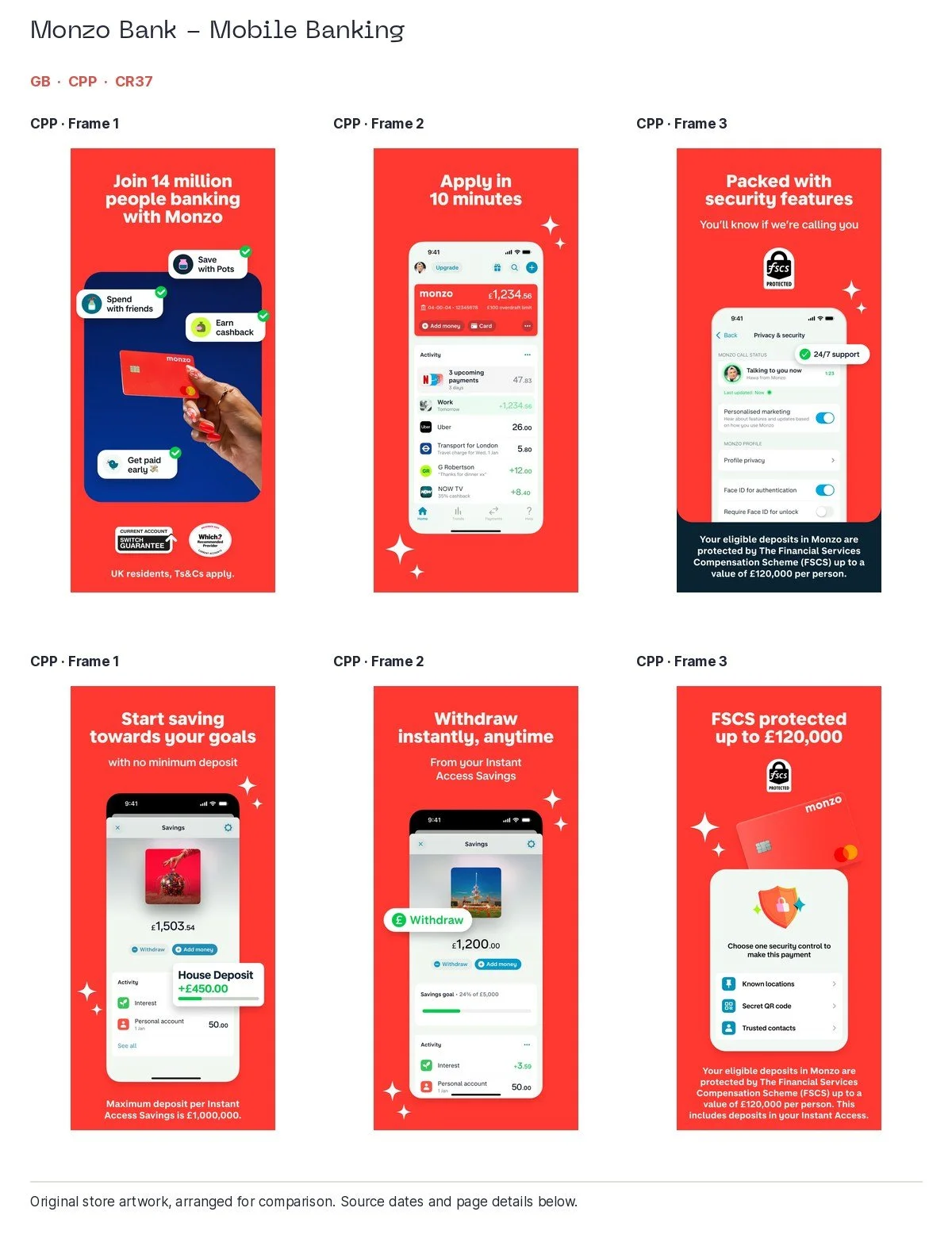
Monzo Bank - Mobile Banking, UK, cpp; associated search: mobile banking; page observed during the preceding 90 days; collected 2026-10-06 | Monzo Bank - Mobile Banking, UK, cpp; associated search: savings app; page observed during the preceding 90 days; collected 2026-10-06. Original app artwork, arranged for comparison.
Expedia's US hotel and flight pages are another strong positive example. The hotel story emphasises bundles, total prices and cancellation; the flight story leads on deals, price tracking and Price Drop Protection. Those are visibly different answers to different travel jobs. Validate the relevant terms and availability before borrowing the promise.
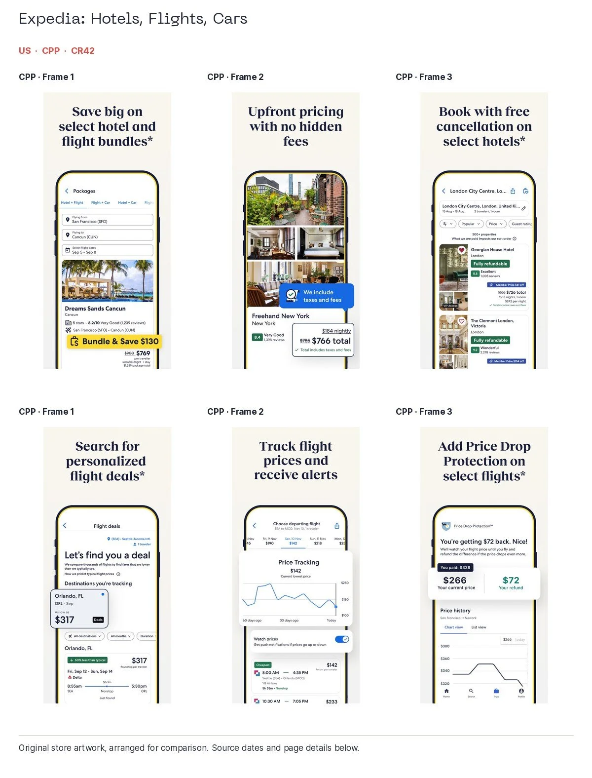
Expedia: Hotels, Flights, Cars, US, cpp; associated search: hotel booking; page observed during the preceding 90 days; collected 2026-10-06 | Expedia: Hotels, Flights, Cars, US, cpp; associated search: cheap flights; page observed during the preceding 90 days; collected 2026-10-06. Original app artwork, arranged for comparison.
Booking.com supplies a useful caution alongside those successes: the first three frames of one captured US hotel CPP visibly repeat the US default, including the same headings and price illustration. That may be a valid routing choice, but we cannot treat the new page identifier as proof of a different creative proposition.
Check the country as well as the task. A Premier League custom page returned in our UK query collection opens on live radio, with an explicit qualification excluding the UK and Ireland. The page is clear about that limitation. I would check the intended territory, keyword assignments and what the eligible visitor actually receives. Check the actual campaign delivery before concluding that the wrong audience saw the page. The qualification is exactly the sort of detail a quick creative score can miss.
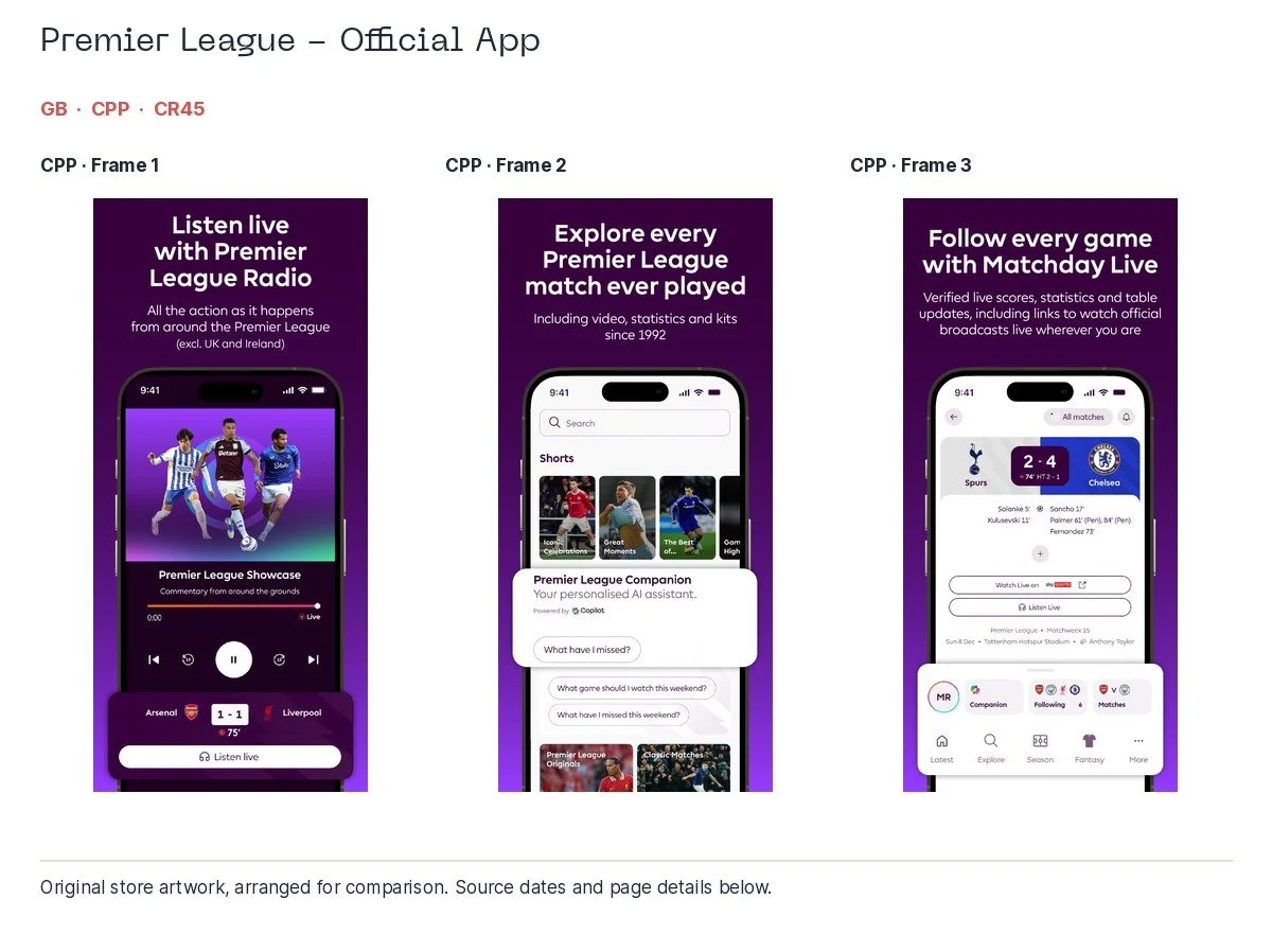
Premier League - Official App, UK, cpp; associated search: live football scores; page observed during the preceding 90 days; collected 2026-10-06. Original app artwork, arranged for comparison.
There is performance evidence for the principle of relevant variations, separate from our visual opinions. Apple's published Babbel case reports a 20% higher tap-through rate and 10% higher conversion rate for ad variations than its default ad. Those are Babbel's reported campaign results, not a forecast for your app or proof that every page we captured performed better. Read the case.
On Android, custom store listings offer a related way to serve different audiences. Google's rules and targeting options differ, and it currently allows up to 50 listings. The practical recommendation is to research each store's searches, then build and measure the relevant route using that store's tools. Google's custom-listing guidance covers the options.
For each page, I would write down the intended query group, audience, first-frame promise and relevant in-app destination. Measure conversion alongside activation, retention and customer value when your own data allows. A page that attracts more downloads but the wrong customers can make the acquisition report look lovely for a surprisingly short time.
Icons earn their small space
An icon has a harder job than most of the people in the creative meeting. It has to be identifiable at a tiny size, beside other apps, without the helpful explanation everyone gave when unveiling it.
Duolingo's large eyes and green face are immediately distinctive. Nike's swoosh and Netflix's N similarly have very little work to do for customers who already recognise them. In our finance comparison, Monzo, Revolut, Wise and PayPal use relatively simple letter or symbol marks. A small icon is a useful place to resist the urge to include the entire strategy.
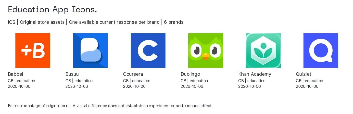
Original iPhone app icons, arranged for comparison.
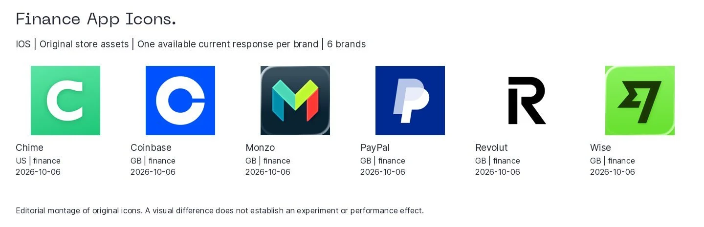
Original iPhone app icons, arranged for comparison.
The useful comparisons are at actual search-result size. Can somebody recognise the mark? Does it disappear among similar colours and shapes? Can a new customer connect it with the product name? A well-known symbol may need very little explanation. An unfamiliar one may need more help from the title and screenshot sequence.
I would keep icon tests focused on a specific problem: recognition, contrast or a clearer relationship to the product. A fashionable redesign is not automatically an acquisition improvement. Test any proposed redesign against the current icon before treating it as an improvement.
Events should give people something
In-app events, or IAEs, let apps showcase timely content, challenges, launches and experiences on the App Store. They can reach new, current and previous users. Apple allows 15 approved events in App Store Connect, with up to 10 published at once. The details and appropriate event types are in Apple's event guidance.
The most useful examples in our collection make the actual reason to open the app visible. Wise's money-to-Mexico event describes a specific transfer task. Depop's visual-search event demonstrates a photographed item leading to matching clothes. Temu's vehicle-fitment event shows the compatibility interface. These are features people can understand, rather than a launch announcement requiring its own explanatory meeting.
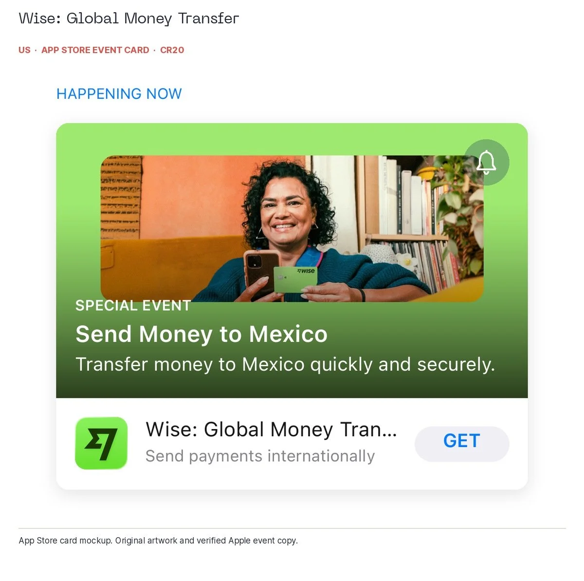
Wise: Global Money Transfer, US, iae; associated search: money transfer; recorded event dates: 2026-09-26T17:00:00Z to 2026-10-25T17:00:00Z; collected 2026-10-06. Reconstructed App Store event card using original artwork and the exact title, event type and short description from Apple. The card illustrates the App Store presentation; see the dates above for event timing.
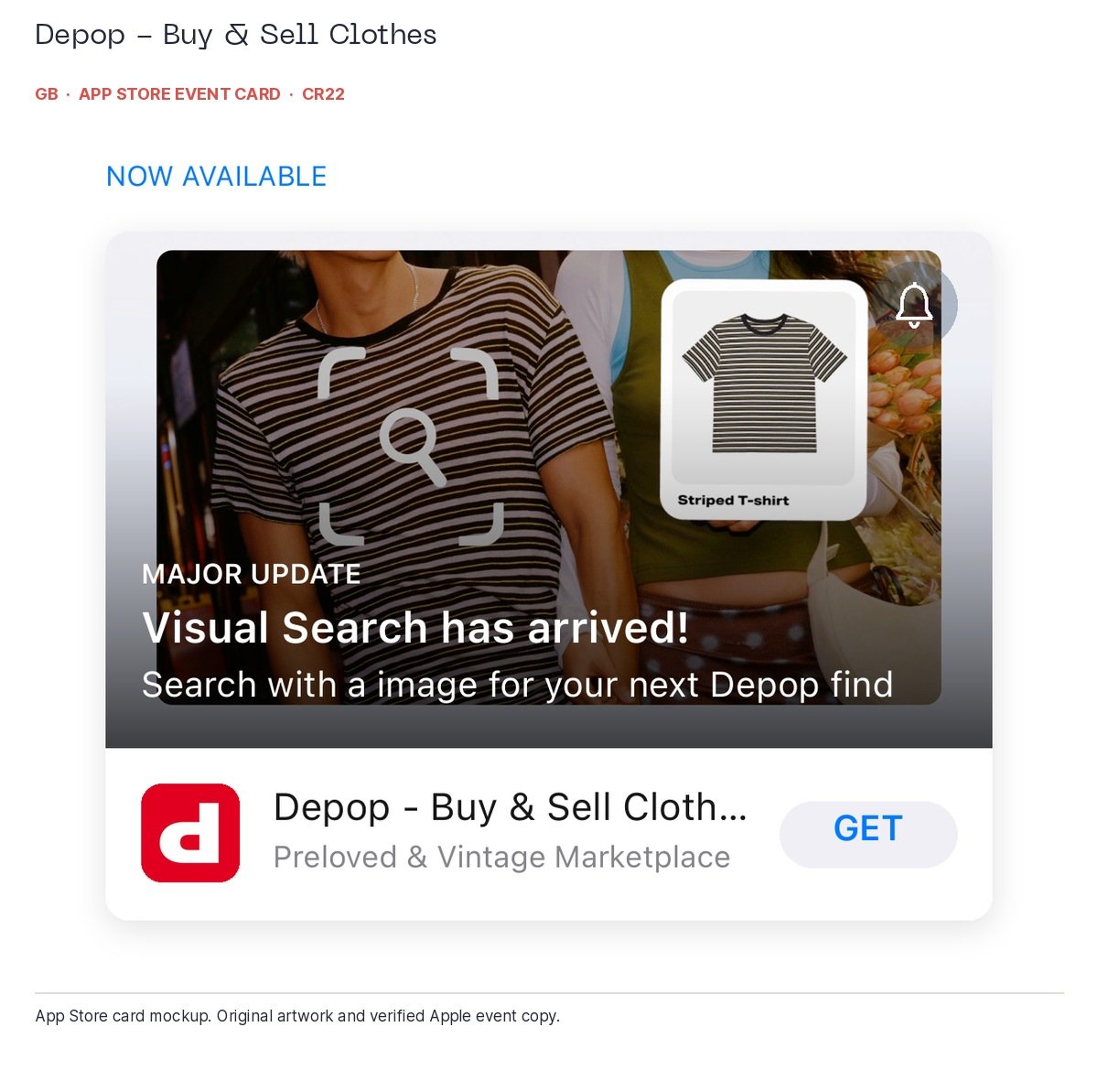
Depop - Buy & Sell Clothes, UK, iae; associated search: shopping apps; recorded event dates: 2026-09-23T16:00:00Z to 2026-10-24T16:00:00Z; collected 2026-10-06. Reconstructed App Store event card using original artwork and the exact title, event type and short description from Apple. The card illustrates the App Store presentation; see the dates above for event timing.
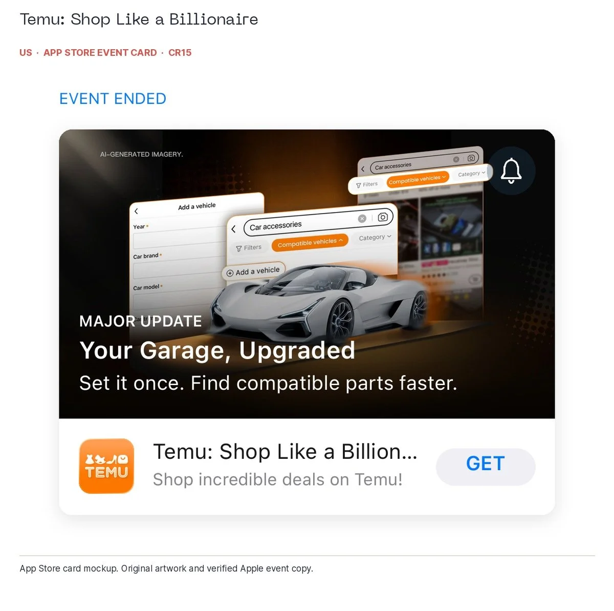
Temu: Shop Like a Billionaire, US, iae; associated search: shopping apps; recorded event dates: 2026-09-05T04:00:00Z to 2026-10-05T04:00:00Z; collected 2026-10-06. Reconstructed App Store event card using original artwork and the exact title, event type and short description from Apple. The card illustrates the App Store presentation; see the dates above for event timing.
Duolingo's Brawl Stars quest gives players a fairly clear bargain: do your Duolingo, earn game rewards. The owl and the game character make the crossover recognisable, while the card explains the incentive. It is an actual reason to take part. Apparently the owl has decided that polite reminders were not enough. The recorded quest ended on 1 October, so this is a historical example; the “LIVE EVENT” badge describes its type, not its availability today.
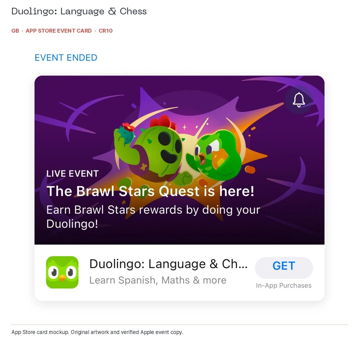
Duolingo: Language & Chess, UK, iae; associated search: language learning; recorded event dates: 2026-09-19T00:00:00Z to 2026-10-01T00:00:00Z; collected 2026-10-06. Reconstructed App Store event card using original artwork and the exact title, event type and short description from Apple. The card illustrates the App Store presentation; see the dates above for event timing.
Retail events work better when there is a recognisable shopping mission. Temu's pet-accessory and device-sticker cards make their collections easy to identify. The sticker event's recorded window runs to 23 October; the pet event ended on 20 September. The SHEIN Halloween event shown here ended on 5 October in the captured record. Reusing the artwork in an October audit does not extend the event. If only campaign calendars were that accommodating.
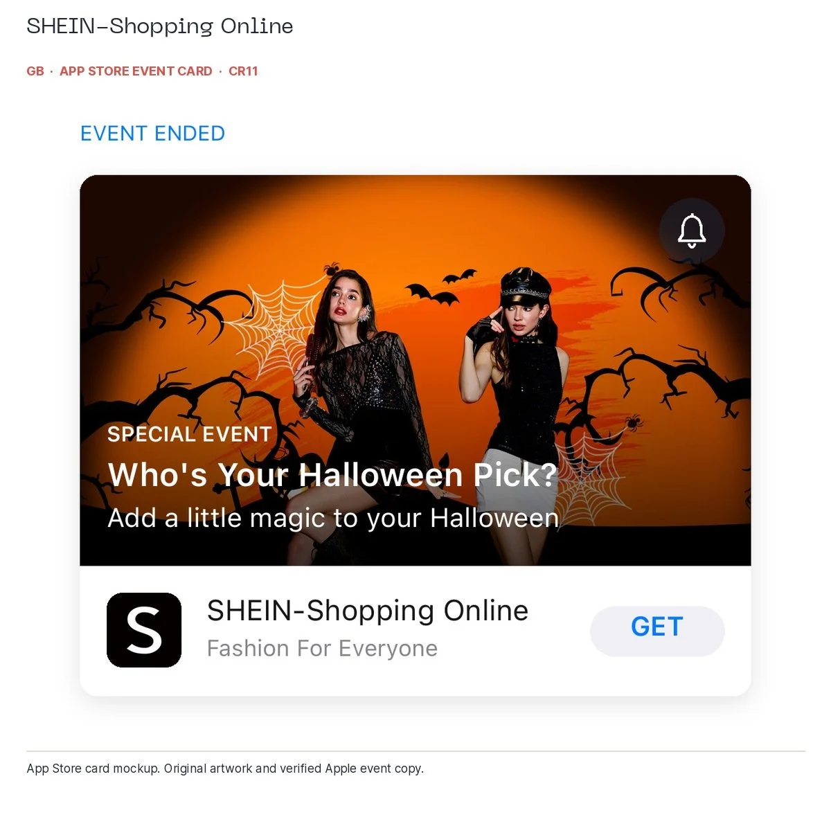
SHEIN-Shopping Online, UK, iae; associated search: shopping apps; recorded event dates: 2026-09-21T03:00:00Z to 2026-10-05T03:00:00Z; collected 2026-10-06. Reconstructed App Store event card using original artwork and the exact title, event type and short description from Apple. The card illustrates the App Store presentation; see the dates above for event timing.
For an example running on 6 October, Strava's October 10k Challenge has recorded dates from 2 to 31 October. The artwork reinforces the brand, while the event card supplies the distance and timing. That gives the runner a concrete reason to open the app. Trainline's Christmas-seats event is also within its recorded September–October window, promoting the December SNCF ticket release. It is a specific travel announcement, rather than a claim that every UK Christmas train ticket is now on sale.
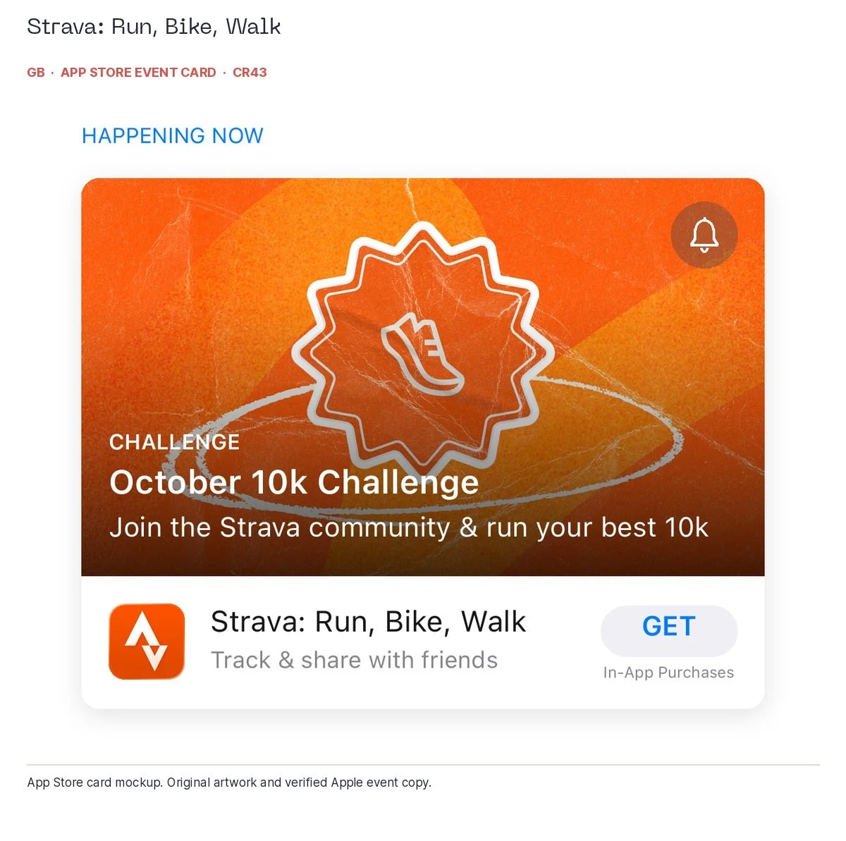
Strava: Run, Bike, Walk, UK, iae; associated search: fitness app; recorded event dates: 2026-10-02T17:00:00Z to 2026-10-31T07:00:00Z; collected 2026-10-06. Reconstructed App Store event card using original artwork and the exact title, event type and short description from Apple. The card illustrates the App Store presentation; see the dates above for event timing.
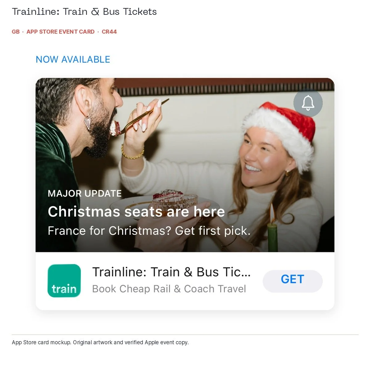
Trainline: Train & Bus Tickets, UK, iae; associated search: train tickets; recorded event dates: 2026-09-30T15:00:00Z to 2026-10-31T15:00:00Z; collected 2026-10-06. Reconstructed App Store event card using original artwork and the exact title, event type and short description from Apple. The card illustrates the App Store presentation; see the dates above for event timing.
For your own event, make the experience, dates, eligibility and destination clear. Then measure event discovery and what people actually do after opening. Google Play promotional content is a separate platform feature with its own eligibility and rules; the iPhone event findings here should not be presented as a Google Play event benchmark.
The stars need reading
A 4.8-star rating makes an ASO meeting considerably more comfortable. Nobody has to explain why the app has upset quite so many people, and someone can put a lovely big star in the presentation. Before the meeting ends, though, I would read what people have actually written underneath it.
The headline App Store rating includes people who leave a rating without writing a review. Our written-review sample gives us a different view, over a different period. It is useful for finding things to investigate and language worth borrowing. It cannot tell us what every customer thinks. Thankfully, you do not need every customer to agree before investigating a repeat complaint about a login screen.
Headline ratings and dated written reviews
iPhone app and storefront | Headline rating | Written reviews in study window | 1–2 stars | 3 stars | 4–5 stars |
Amazon, UK | 4.8 | 281 | 190 | 30 | 61 |
eBay, US | 4.8 | 500 | 444 | 25 | 31 |
Duolingo, US | 4.7 | 500 | 111 | 38 | 351 |
Calm, UK | 4.7 | 110 | 39 | 9 | 62 |
Source: APPlyzer store ratings and written reviews, collected 6 October 2026. Reviews shown are dated 8 July–5 October 2026. The headline rating includes ratings without written reviews; the table counts the written reviews examined.
Take eBay. Its US iPhone listing carried a 4.8-star rating across roughly five million ratings when we checked. Inside our sample of 500 US written reviews dated 21 August to 4 October, we also found a five-star review complaining: “TOO MUCH FOCUS ON LIVE!!” The customer describes missing sorting options and friction when listing items. Five stars and capital letters are fairly important qualifications if your review analysis begins and ends with a coloured sentiment chart.
One five-star US iPhone Duolingo reviewer says Spanish lessons helped them “ask for (and follow) directions!” That is useful language for an ASO brief. It gives us a person, a task and a benefit. A one-star reviewer, meanwhile, objects to tapping through adverts, treasure chests and gems after a lesson: “It’s click fatigue and so frustrating.” The learning outcome and the irritation can both exist. Getting someone excited about learning Spanish does not mean they have developed a lifelong ambition to open virtual treasure chests.
Calm supplies the sort of example that makes the problem particularly easy to picture. Its UK iPhone headline rating was 4.7. Among the 110 UK written reviews in our 8 July to 5 October sample, 62 received four or five stars and 39 received one or two. A five-star customer on 25 September describes a routine that has lasted for years: “I wake up and use it and I go to sleep using it.” That is a clear reason people value the product, with useful morning and bedtime use cases attached.
Two days later, another UK reviewer praises the content but describes repeated sign-ins, menus, losing their place and upgrade prompts when trying to get back to sleep at 3am. Their reported destination is “you're wide awake.” Getting the customer fully alert is a slightly awkward outcome for a sleep app.
There is a practical brief here for both teams. Product should inspect the night-time journey the reviewer describes. Marketing could test a sleep-specific page that shows how to reach the relevant content, provided that the actual experience supports the promise. A lovely screenshot of somebody asleep will not remove a login prompt. Reviews help us identify where the product needs attention before we enthusiastically advertise the opposite experience.
Amazon’s UK screenshots give us another angle. The first two we inspected emphasise everyday prices and inexpensive trending products; the third shows searching across categories. This is clear, specific value messaging. But a five-star UK review dated 18 July describes a rather different shopping benefit: rescuing last-minute school costume days and birthday purchases. The reviewer praises how easy it is to search, order and pay. Any parent who has discovered tomorrow’s costume requirement at 8pm can probably supply the emotional detail without a focus group.
A one-star UK review dated 30 September, meanwhile, describes confusion around seller selection and asks for clearer links and labels in the returns journey. Those two accounts give us useful things to investigate. The positive experience suggests testing creative around a recognisable shopping mission, with genuine delivery reassurance where the service supports it. The criticism supplies something for the product team to inspect. You can celebrate the convenience customers value while being precise about the experience you promise.
Read reviews carefully before turning them into a creative brief. Off-topic promotions can appear even in five-star reviews. Keep genuine customer detail, check the original wording and build a testable promise the app can deliver.
Look further down the auction
Organic search tells us who gets found. Apple Search Ads, now branded Apple Ads, adds another competitive view. Our recorded APPlyzer auction stacks let us inspect much more than whichever advertiser happened to be most obvious at the top.
For this part of the study, we used eight complete US iPhone stacks recorded on 6 August 2026, covering sports, fantasy and casino-related searches. Each contains explicit positions from one to 100. There are 800 observations and 332 different apps across them. This is a historical example from those searches, not a current benchmark for every sector in this article.
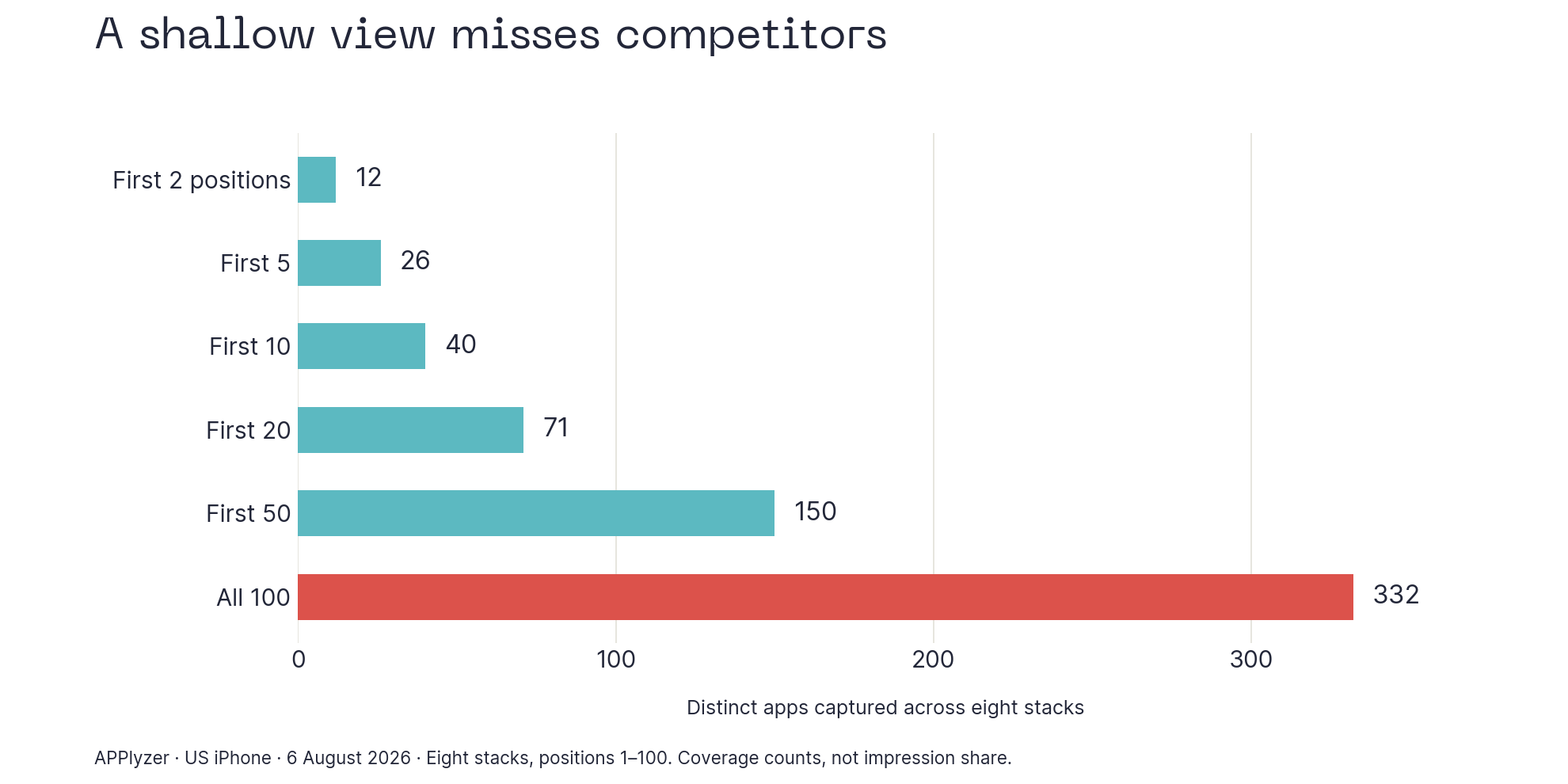
Recorded auction coverage across eight selected US searches on 6 August 2026. Counts are distinct apps across stacks, not customer impressions.
Keep only the first five positions and you see 26 of those 332 apps. Keep the first 50 and you see 150. Another 182 apps appear only below that cut. Among the 41 apps with a recorded custom page somewhere in the stacks, 16 disappear entirely if we stop at position 50.
We also pulled the recorded daily organic results for two of those searches on the same date. For “Fantasy Sports”, DraftKings: Sports & Casino sits at recorded auction position two and daily organic position 76. For “Sports Picks”, SHEIN sits at auction position 94 and is absent from the 100 organic apps returned. These are separate hourly auction and daily organic observations, but they make the point: an organic competitor list can leave out much of the paid competitive picture.
Across the first ten organic and first ten auction positions, neither query has an app in common in these snapshots. I would inspect both sets before writing the brief.
That matters when deciding which competitors and creative to inspect. A shallow view can miss an app, its page or an unexpected connection between categories. It does not mean the lower positions received lots of impressions. Position coverage and advertising share of voice are different measures.
Some familiar names below the obvious neighbours
Recorded search | App | Recorded auction position | Observation date |
Fantasy Sports | Bleacher Report | 4, with a custom page | 6 August 2026 |
Fantasy Sports | Paramount+ | 41 | 6 August 2026 |
DFS | Fetch | 52 | 6 August 2026 |
DFS | Schwab Mobile | 92 | 6 August 2026 |
Sports Picks | SHEIN | 94 | 6 August 2026 |
Source: APPlyzer recorded US iPhone auction stacks, en-US. Recorded positions describe the competitive order, not how much an advertiser spent or how many people saw its ad.
Finding SHEIN deep in a sports-picks stack is a little like finding the clothing aisle behind the betting counter. It makes you look twice. It does not tell you that SHEIN's team deliberately bought the phrase or wasted its budget there. Search matching, eligibility and campaign settings need investigating before anyone gets blamed.
Here is the actual Bleacher Report custom page attached to recorded position four for “Fantasy Sports”. The page identifier matches the custom artwork in the August record. Its first two frames establish sports-news identity through an athlete panorama; the third shows scores, statistics and standings.
That is useful sports proof. There is no visible roster, captain or league-management task in those first three frames. I would investigate what the fantasy audience needs and whether the app serves it before creating a fantasy-specific promise. Being in the relevant auction does not make every sports screenshot equally relevant to the task.
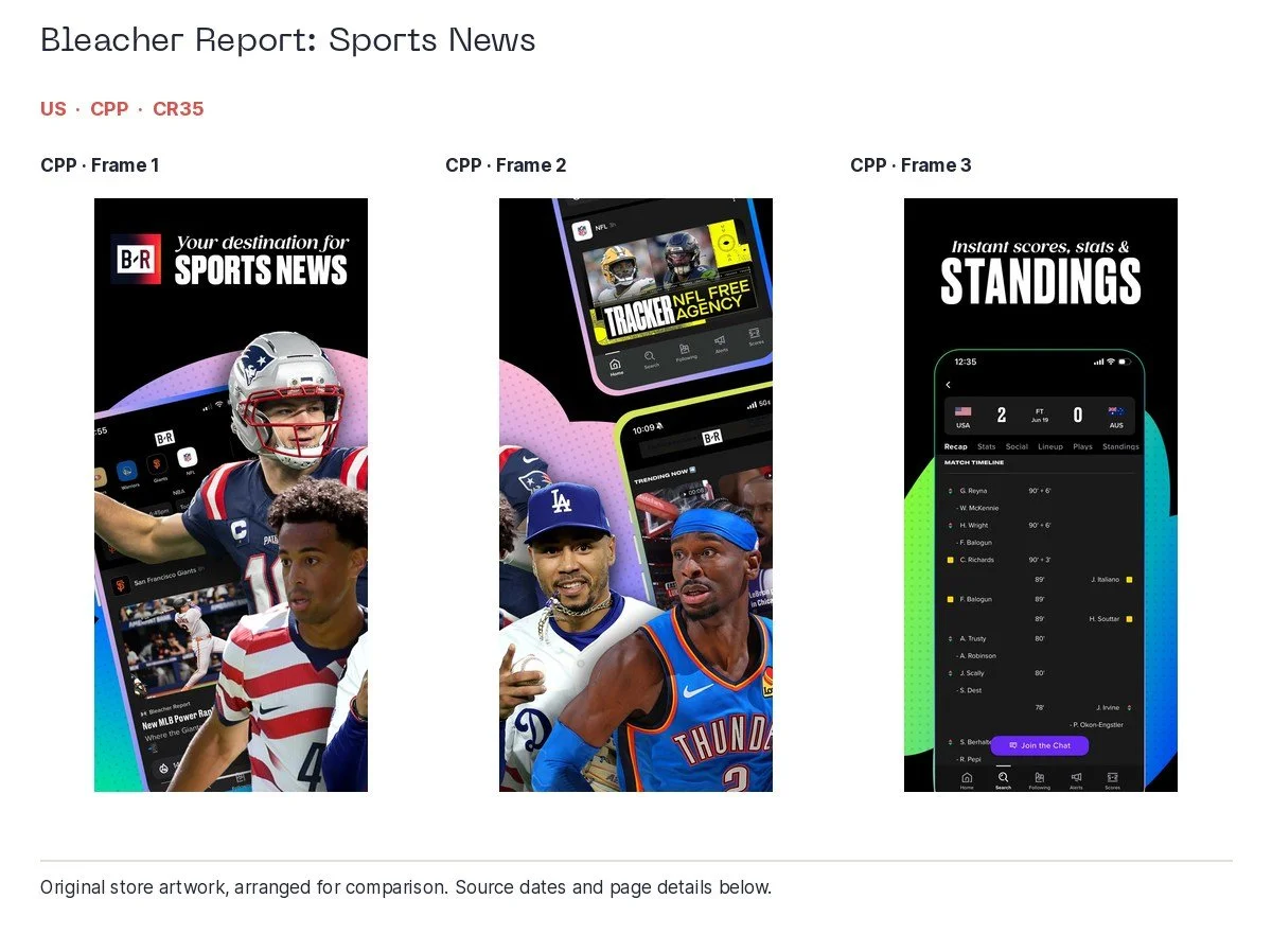
Bleacher Report CPP, US, Fantasy Sports; recorded auction position 4 on 6 August 2026. Original app artwork, arranged for comparison.
The useful workflow is to put three things beside one another: the organic results, the recorded paid competitors and the actual creative attached to the relevant page. Then add the customer's task. Who is competing for attention, what are they promising and where could your app provide a clearer answer?
Turning the stack into a practical creative brief
What you observe | What to investigate | What you might test |
A relevant specialist appears deeper in the stack | Its offer, page and recurring presence over time | A clearer task-specific opening, if your product serves that task |
An unexpected category appears | Whether the match recurs and what your own search-term report shows | Tighter campaign organisation or exclusions when your account data supports them |
A competitor uses a custom page | The actual custom assets and their fit to the query | A focused page with a measurable audience and destination |
Your organic position is weak but ads are present | Metadata relevance, traffic quality and the cost of acquisition | An organic and paid plan measured together, with conversion and value kept separate |
Our earlier published metadata and auction study reported 56,063 observations. Apps with more relevant titles tended to appear higher, even when differences between apps, searches and dates were considered. The analysis did not find a clear independent link between screenshot relevance and position. That is a useful reason to keep the metadata and creative questions connected, while measuring what each can actually explain.
Likewise, our August custom-page observations sit higher on average than default-page observations, but the campaigns and advertisers differ. That comparison is not proof that making a CPP earns you an auction-ranking bonus. Use the data to decide what to investigate and test, then use your own campaign outcomes to judge whether it worked.
What matters in 2026?
The foundations still matter: relevant metadata, understandable creative, useful reviews and a product people want to keep using. The stores are giving us more ways to tailor the introduction.
CPPs can be assigned to selected App Store search keywords, so the organic visitor can see a more relevant version of the page. Apple also describes app tags generated by AI from supplied metadata. Its developer session explains that this includes material such as screenshots. That makes clear, accurate product communication sensible; it does not establish that repeating a keyword in screenshot captions is a direct ranking shortcut. Apple's session explains the tag process.
There is also a very recent addition to the creative brief. On 5 October 2026, Apple announced new product-page header and search-result creative assets, an asset preview tool and an Asset Library. Check the current availability and specifications before designing for them. Apple's announcement.
More surfaces give you more opportunities to explain the product. They also give you more opportunities to explain six unrelated things at once. I would sort out the audience and promise before opening another design file.
What I would do first
If this were my app, I would start with a manageable set of important searches and work through them properly. The point is to leave the audit with a few useful decisions, rather than a very impressive folder nobody opens again.
- Week one: collect the evidence. Split searches by task, country and store. Record current positions, relevant competitors, default pages, CPPs and dated events. Read a capped, clearly dated review sample, then compare recurring issues with product and support data.
- Week two: write the brief. Choose one audience with a real opportunity. State the promise, show the existing product proof and identify what to bring forward. Check the whole sequence before commissioning replacement artwork. Resolve product friction before promising its opposite.
- Week three: launch a measured test. Use the appropriate store tools, route the intended audience correctly and define success beforehand. Keep a dated record of metadata, creative, campaigns and releases. Apple's native Product Page Optimization does not test CPPs, so do not describe an uncontrolled comparison between a CPP and the default page as a controlled Product Page Optimization test.
- Week four: read the result. Look at downloads and conversion, then activation, retention and customer value where available. Check whether the audience changed. Allow the sample to accumulate enough evidence; a calendar month is a work plan, not a guarantee of a clear result.
Borrow what is clear from the big apps: Babbel's product demonstrations, Pimsleur's specific language story, Depop's visual-search proof, and the way eBay changes its opening for different markets. Challenge the bits that ask a visitor to do too much interpretation.
And use the auction stack to broaden the competitive picture. It can show you an app or a creative route your usual competitor list would miss. Just remember that finding somebody in the data gives you a question to investigate, rather than permission to invent their media plan.
You do not need to be bigger than Amazon to put the useful screenshot first. Which is fortunate, because getting bigger than Amazon looks like quite a lengthy project.
If you want a second pair of eyes on your app's searches, pages and Apple Ads, get in touch with CMA. Bring the app and the markets you care about. We can start there.
A few common ASO questions
Is ASO still useful in 2026?
Yes. App Store Optimization helps people discover an app and understand its value in the store. Our cross-store examples show why brand recognition alone is not enough to assume visibility for a particular search. Measure acquisition alongside what those customers do after installing.
Do CPPs improve organic rank?
Apple lets developers assign selected keywords to custom product pages so a relevant page can appear instead of the default. That is a way to tailor presentation. It is not a documented automatic boost to organic ranking, so judge its value by the audience response.
Are screenshots ranking factors?
Screenshots communicate the product and may appear in search results. Apple also describes their use in generating app tags. That is different from publishing a direct caption-keyword ranking weight. Write clear, truthful captions and test customer response.
Is a high star rating enough?
It is useful, but it does not replace reading reviews. Headline ratings and recent written reviews show different sides of customer experience. We found praise, specific complaints and even five-star criticism inside major apps' review feeds.
Is auction position share of voice?
APPlyzer contains SoV data for ad positions 1, 2 and overall however we haven't included the ASA SoV data in the article (you can try it for free though if you're curious at www.applyzer.com!