

Research by ConsultMyApp, powered by APPlyzer data
A hands-on look at research using app marketing tools
APPlyzer research across three markets shows how search visibility, download scale and competitor creative can shape a more useful campaign plan.
Revolut accounted for 72.44% of estimated UK downloads among five money transfer and finance brands in our comparison. Yet it earned just 0.34% of modelled organic visibility across our sample of transfer searches. Those figures describe different parts of the growth picture. The creative a customer sees adds another: which task does the app choose to explain first?
We used APPlyzer to investigate all three questions across the UK, US and Australia. The research combines organic rankings, observed Apple Ads results, download estimates and genuine App Store creative from Wise, Revolut, Remitly, Xe, WorldRemit, Taptap Send and Western Union. The result is a practical way to turn market intelligence into a local campaign plan and a stronger creative brief.
ConsultMyApp develops app marketing software and provides app growth consultancy. APPlyzer is part of the ConsultMyApp group. Here we show how app marketing software can shape design thinking, from identifying the competitors a customer encounters to deciding what a screenshot, event or custom page should communicate.
Compare three sides of the market
A useful comparison separates organic search visibility, advertising visibility and download scale. Each answers a different question. Combining them helps a team decide which audiences and propositions deserve closer investigation.
| Measure | Question it answers | Boundary |
|---|---|---|
| Organic share of voice | Which apps hold prominent organic positions for the sampled queries? | A CMA rank-weighted model, not measured search traffic |
| Observed Apple Ads share of voice | Which apps appear in the returned advertising results? | A sample of auction visibility, not account impression share or spend |
| Share of estimated downloads | How large are the compared apps relative to one another? | Modelled whole-app downloads within a named five-brand panel |
Organic visibility changes by country
We collected the first 50 organic results for the same 12 generic transfer queries in each market. The simplest starting point is coverage: how many searches put an app in the top 10? Xe reached that threshold on 11 Australian phrases and only two UK phrases. Remitly covered all 12 in the UK and US; WorldRemit covered all 12 in Australia.
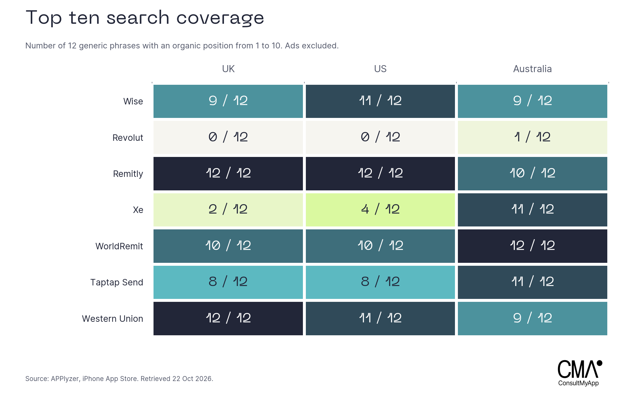
Coverage does not distinguish a first position from a tenth. Our organic share of voice, or SoV, adds a transparent weighting: each result earns one divided by its rank, through position 50. We sum those points across the queries and divide by the points earned by every returned app in that country. All queries have equal weight. This models prominence within the sample; it does not estimate actual impressions or visits.
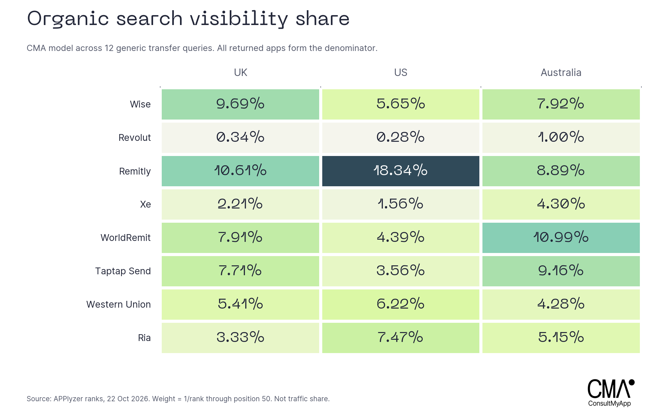
Remitly led the model in the UK at 10.61% and the US at 18.34%. WorldRemit led Australia at 10.99%, followed by Taptap Send at 9.16%. Wise earned more UK visibility than Western Union, 9.69% against 5.41%, despite narrower top-10 coverage. Wise held seven top-three positions; Western Union held four. Position changes the reading of the market.
The results also widened our competitor list. Ria Money Transfer, outside the initial seven-brand shortlist, earned 7.47% of US modelled visibility, second across all returned apps. Its UK and Australian shares were 3.33% and 5.15%. App campaign management should leave room for competitors to emerge from customers’ actual search results.
Apple Ads adds another perspective
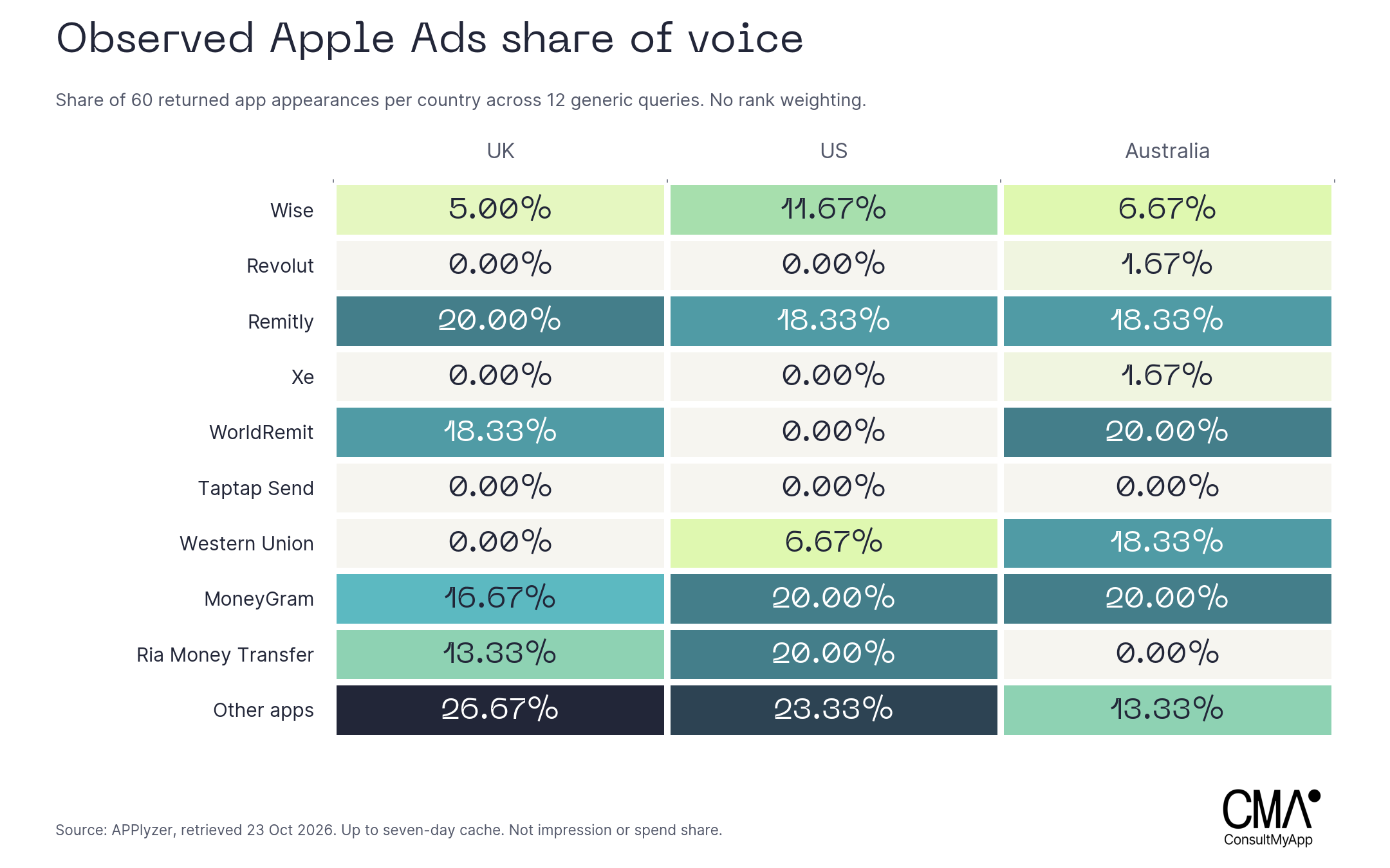
For Apple Ads SoV, we counted each app returned for a query once, then divided its appearances by all returned app appearances in that country. The completed sample contained five apps per query, or 60 appearances per country. We apply no prominence weighting because the API does not explicitly establish the array order as auction rank. These are returned advertiser observations, not five ad slots shown together.
Remitly appeared on all 12 UK queries, giving it 20.00% of the observed appearances. WorldRemit followed at 18.33%. In the US, MoneyGram and Ria each appeared on all 12 queries and each earned 20.00%; Remitly appeared on 11 and earned 18.33%. Australia was led jointly by WorldRemit and MoneyGram at 20.00%, followed by Remitly and Western Union at 18.33%.
Taptap Send had strong organic visibility, including a first position for “money transfer” in the UK and Australia, but no returned paid appearances in this sample. That distinction is worth investigating, without concluding that the brand runs no advertising. The responses may include cached observations up to seven days old, and a limited keyword sample cannot describe every campaign.
For app campaign management, use the comparison to choose which searches and competitors to inspect in your own account. Organic prominence and observed advertising presence describe different competitive pressures. Budget decisions still require first-party costs, conversion, customer value and incremental results.
Download share needs a defined market
For download scale, we compared the same five brands in every country: Wise, Revolut, Remitly, Taptap Send and Western Union. APPlyzer returned 29 reported dates within 23 September to 22 October 2026. There was no estimate for 3 October. Xe and WorldRemit had no US estimates, so we excluded both from the cross-country share calculation rather than treating unknown values as zero.
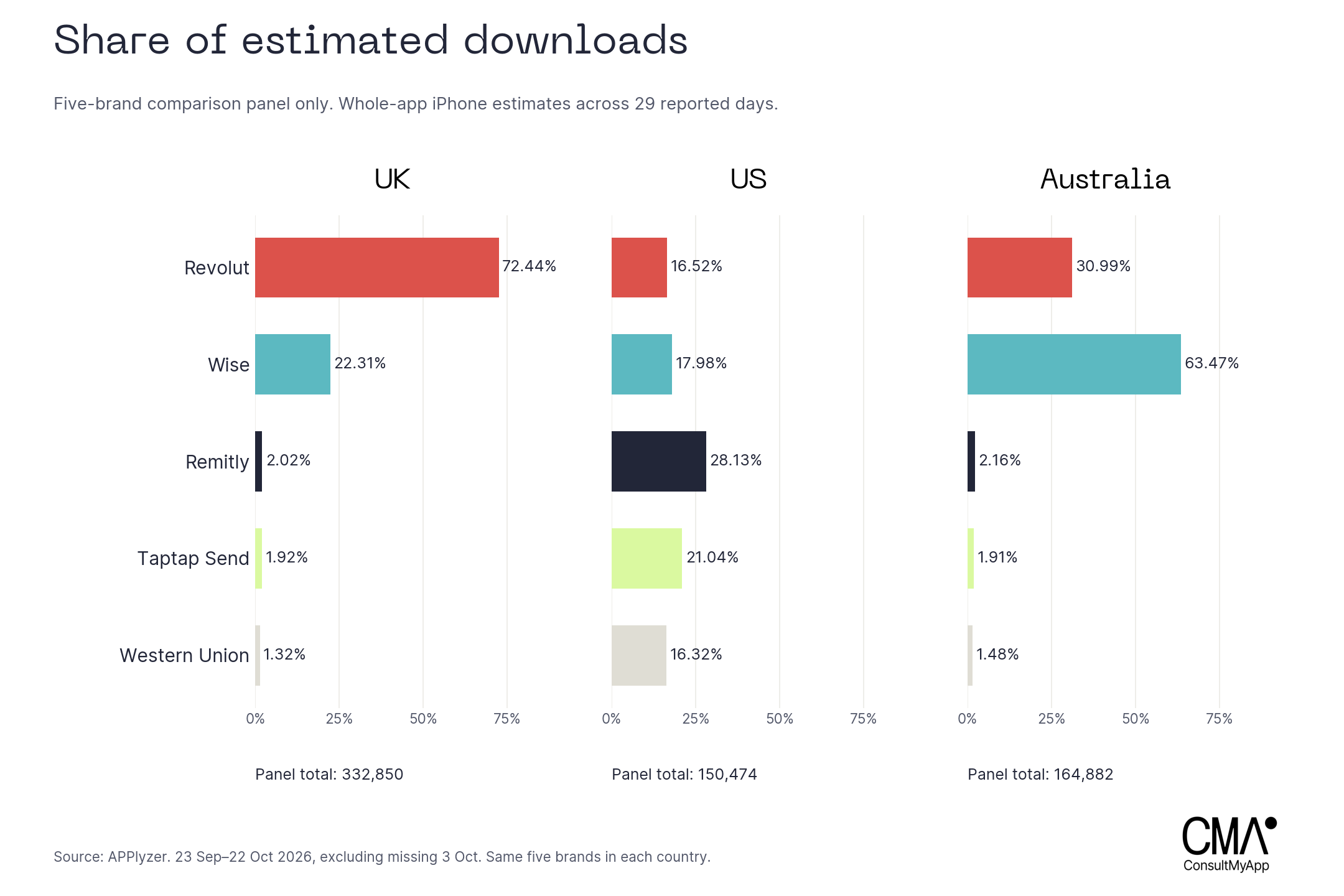
Revolut took 72.44% of the UK panel’s estimated downloads and Wise 22.31%. Australia was led by Wise at 63.47%, followed by Revolut at 30.99%. The US was more evenly distributed: Remitly 28.13%, Taptap Send 21.04%, Wise 17.98%, Revolut 16.52% and Western Union 16.32%.
The difference between Revolut’s UK download scale and transfer-search visibility is useful context. A broad financial app can be installed for many reasons beyond international transfers. Before treating a search gap as an urgent problem, decide whether that customer need is a priority for the business. The data identifies a question for strategy; it does not show which creative or campaign caused the downloads.
Choose a local creative question
A country comparison becomes useful when it changes the brief. In the UK, APPlyzer’s search score was 50 for “send money abroad” and 15 for “send money”. In the US, those scores were three and 35 respectively. Scores are relative indicators, not search counts. The language and customer task deserve a local check before a global message is rolled out.
Destination intent adds another layer. Taptap Send appeared in the top 10 for all four destination searches in all three countries: India, Pakistan, Nigeria and the Philippines. Xe reached none of those Australian top 10s despite covering 11 of the 12 generic phrases there. A team could investigate whether a destination-specific proposition is commercially relevant, supported by the product and explained clearly enough in its creative.
This is where the research should move from ranking tables into design thinking. Identify a specific person, task and uncertainty. Then ask what the first visual needs to resolve. A customer sending money to a mobile wallet may need payout detail; a business paying suppliers may need a different account story. Those are different briefs even when the underlying app is the same.
Creative Ideation
Creative ideation starts by studying the decisions in an execution. What receives the most space? Which claim appears before the interface? What stays recognisable when the audience changes? Keep these observations connected to the audience, the source asset and the hypothesis being tested.
The examples below use original publisher artwork retrieved through APPlyzer. Numbered annotations identify visible choices. Our explanations of their likely creative role are editorial interpretations, not statements of the brands’ internal strategy or evidence of conversion performance. Offers, ratings and numerical claims are reproduced as observed creative and may change.
Iconography
The icon has to work before someone reads a screenshot. Our seven examples use several different routes to recognition. Wise pairs an intense green field with a directional mark. Revolut uses a spare black R on white. Xe makes its lower-case name and circular stroke dominant. These shapes can survive at small sizes without explaining the entire service.
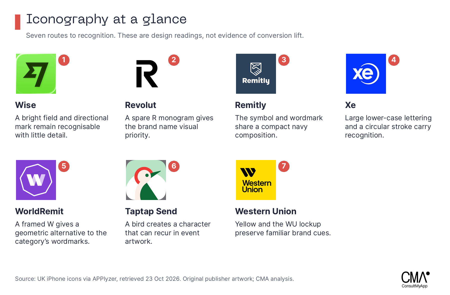
Remitly combines a compact symbol and wordmark on navy. WorldRemit uses a framed W against purple. Western Union carries forward yellow and its familiar lockup. Taptap Send takes another route with an illustrated bird, a character that can recur in event artwork. The useful observation is the relationship between each icon and the wider creative system. A brand can create recognition through a colour, letterform, symbol or character, provided that cue remains legible.
For your own direction, place the current icon beside the local competitors at realistic App Store sizes. Check silhouette, contrast and recognition without the app name. Decide which distinctive asset must stay fixed and what could be simplified. Avoid choosing a colour because of an assumed universal meaning such as trust; the public examples do not establish that effect.
Turn the audit into one testable change, such as increasing the mark’s size while retaining the established colour. Apple’s product page optimisation supports tests of default-page icons, screenshots and app previews. Measure conversion and the quality of acquired users where your data supports it. A remembered icon is useful only if it represents the right product.
Screenshots
Screenshot research should examine the order of the argument. Apple’s product-page guidance recommends showing the app in use and letting the opening screenshots communicate its essence. In a competitive audit, record the first proposition, the product evidence and the next concern each frame answers. A board of attractive images alone loses that sequence.
Wise makes the mechanism visible. Its UK opening frame presents a sending-money-abroad proposition with a prominent GBP-to-EUR calculation. The next frame expands to an account for use at home and abroad, using balances, a card and a real-world setting. The third adds a protection headline and social proof. We read this as a progression from an immediate transfer task to broader use and reassurance.
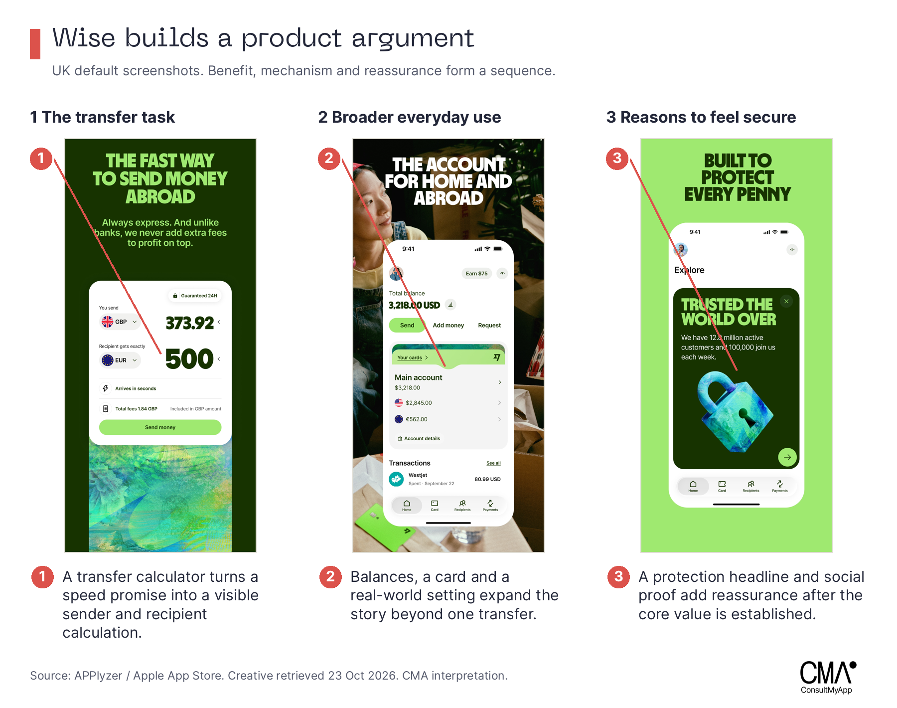
A reader can borrow the structure without copying the appearance. Name a customer task, show the actual interface that completes it, then address the next important uncertainty. Brief the designer on what the UI proves. Enlarging a phone mock-up will not help if its contents do not explain the claim.
Remitly starts with confidence. The UK sequence leads with safety and global transfers, then pairs its “100+ currencies” headline with a GBP-to-INR transfer calculator. An introductory offer appears in the next frame alongside a human scene. The likely role of this order is to establish suitability and reassurance before developing the incentive. That is a hypothesis about the communication, not proof that the order is optimal.
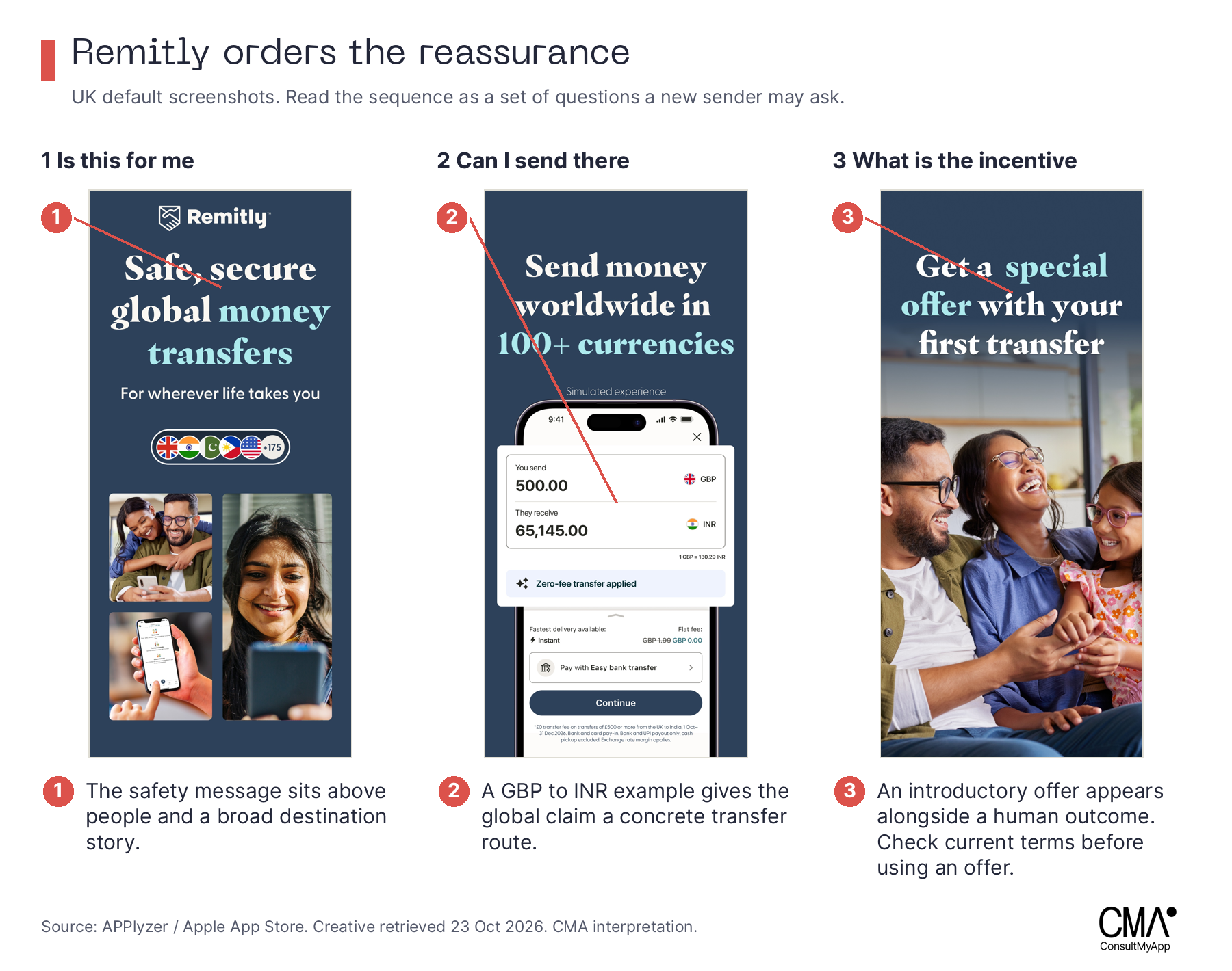
For an app where a first transaction carries anxiety, develop two opening concepts: one that demonstrates the transaction and one that answers the most important concern. Keep the destination, offer and later frames stable when testing the opening proposition. Use genuine UI, current terms and evidence for every claim.
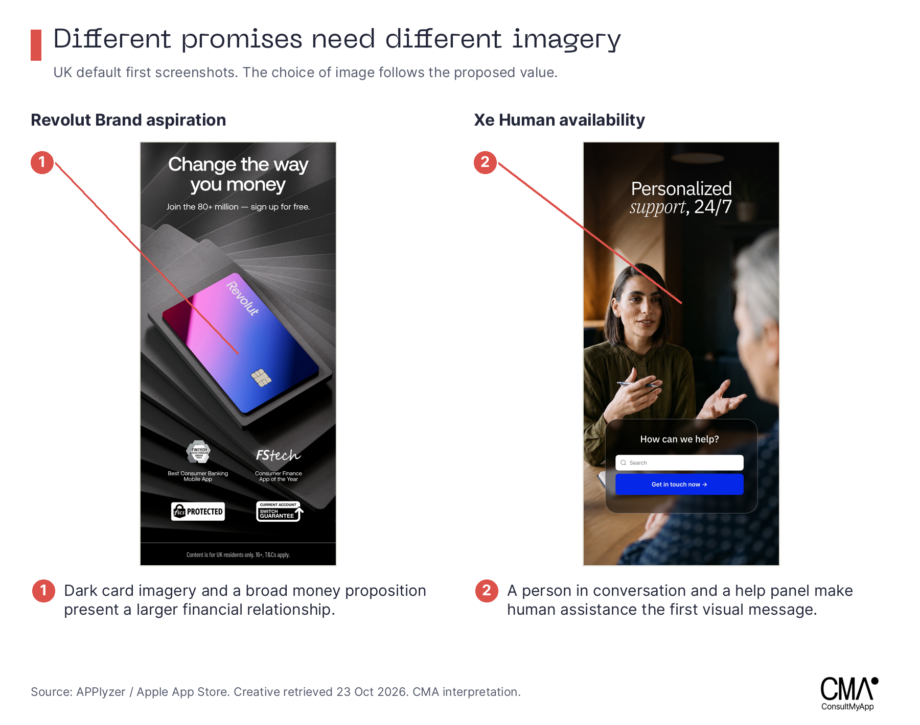
Revolut and Xe frame different relationships. Revolut’s UK first screen combines dark card imagery with a broad money proposition. Xe pairs a person in conversation with a visible help panel. The contrast helps a team choose the role of imagery: aspiration around a broader financial relationship, or tangible human availability. Choose the role that fits the customer task and product evidence.
Localisation changes the proposition. Western Union’s first UK frame foregrounds destination breadth and an introductory fee offer. The US frame leads with adoption by other users. Australia shows a fee message with an AUD-to-Philippines transfer interface. All retain recognisable yellow and black. Localisation here involves the opening reason to consider the app, as well as the currency and words.
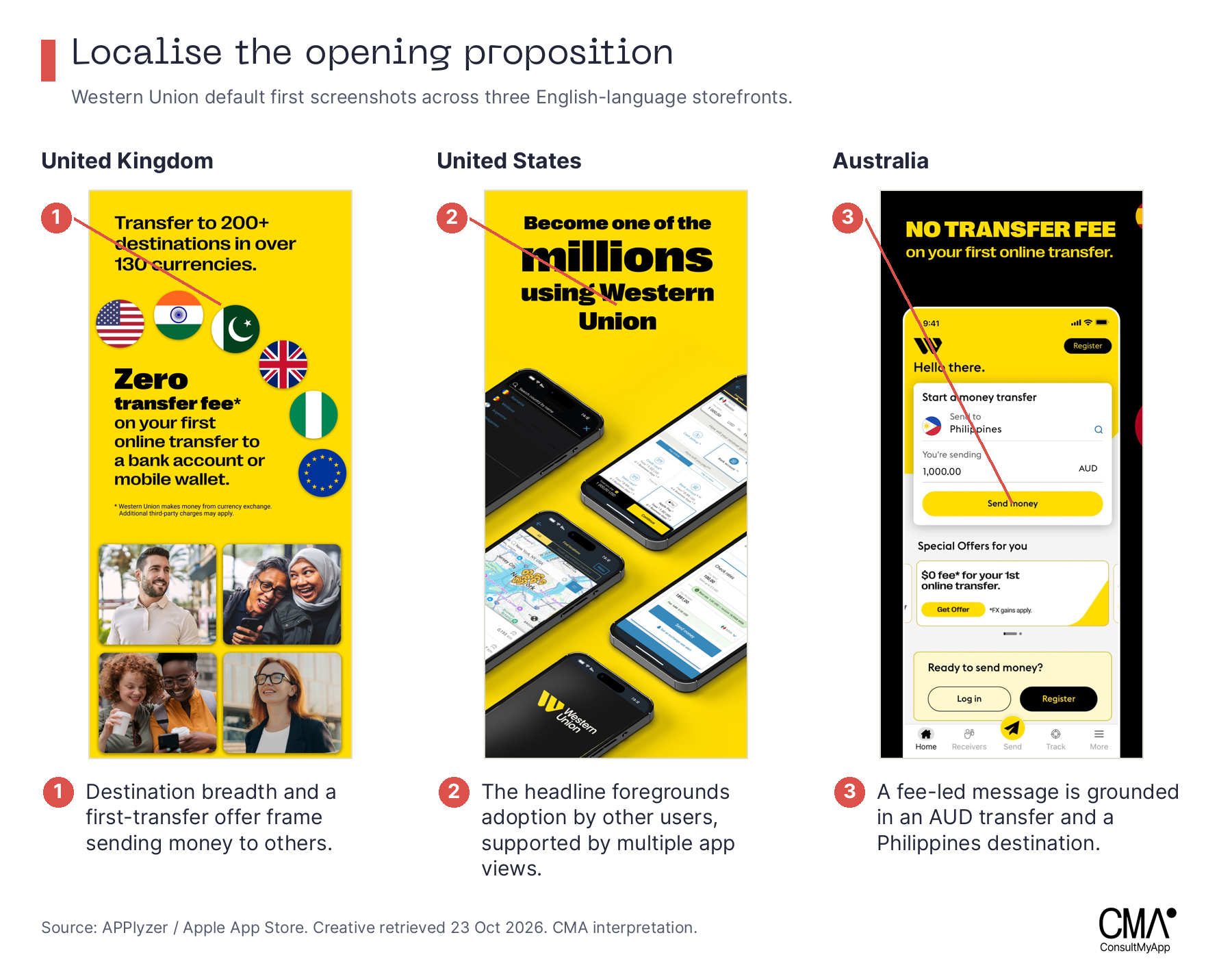
Create a localisation matrix before designing variants: sender country, destination, currency, payout method, main uncertainty and supporting evidence. Keep the identity recognisable while making the product example accurate. Review language and cultural detail with people familiar with the intended audience.
Show what happens after sending. Taptap Send pairs a quantified speed claim with a screen saying “Your transfer is on the way”. WorldRemit shows a payment-success message and a timeline of transfer stages. Confirming that a transfer has started answers a different question from confirming that it has arrived. Brief the exact stage your interface can substantiate, and support any speed claim with current evidence.
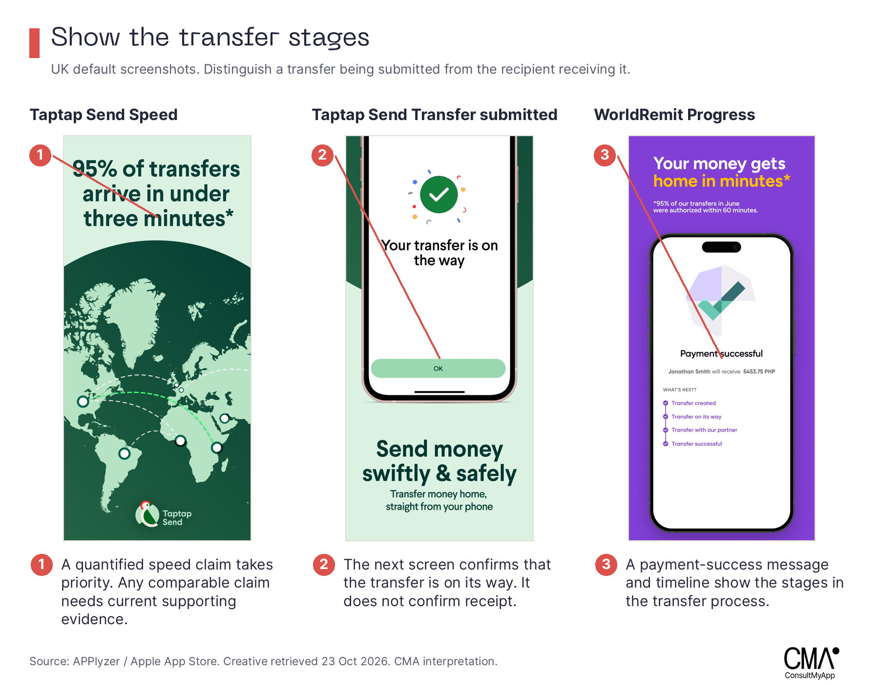
A sensible screenshot test changes a defined idea. Compare an outcome-led opening with a process-led opening, or change the prominence of a specific proof point. If you change the claim, audience, offer and visual style together, the result may identify a preferred package but will not isolate which decision helped.
IAEs
In-app events, or IAEs, add a reason to engage now. Apple presents event cards with artwork, a name and a short description. The creative brief should connect that combination to a genuine event or meaningful update inside the app. An ordinary promotion alone is not a substitute for an eligible experience. Keep artwork and metadata complementary rather than repeating a full headline in the image.
Western Union connects to an occasion. Its UK event “Send Diwali blessings” runs from 12 October to 12 November 2026 in the captured metadata. Two women with sparklers, festive clothing, lamps and garlands make the occasion visible. The artwork supplies the celebratory scene; the event name and description connect it to sending money.
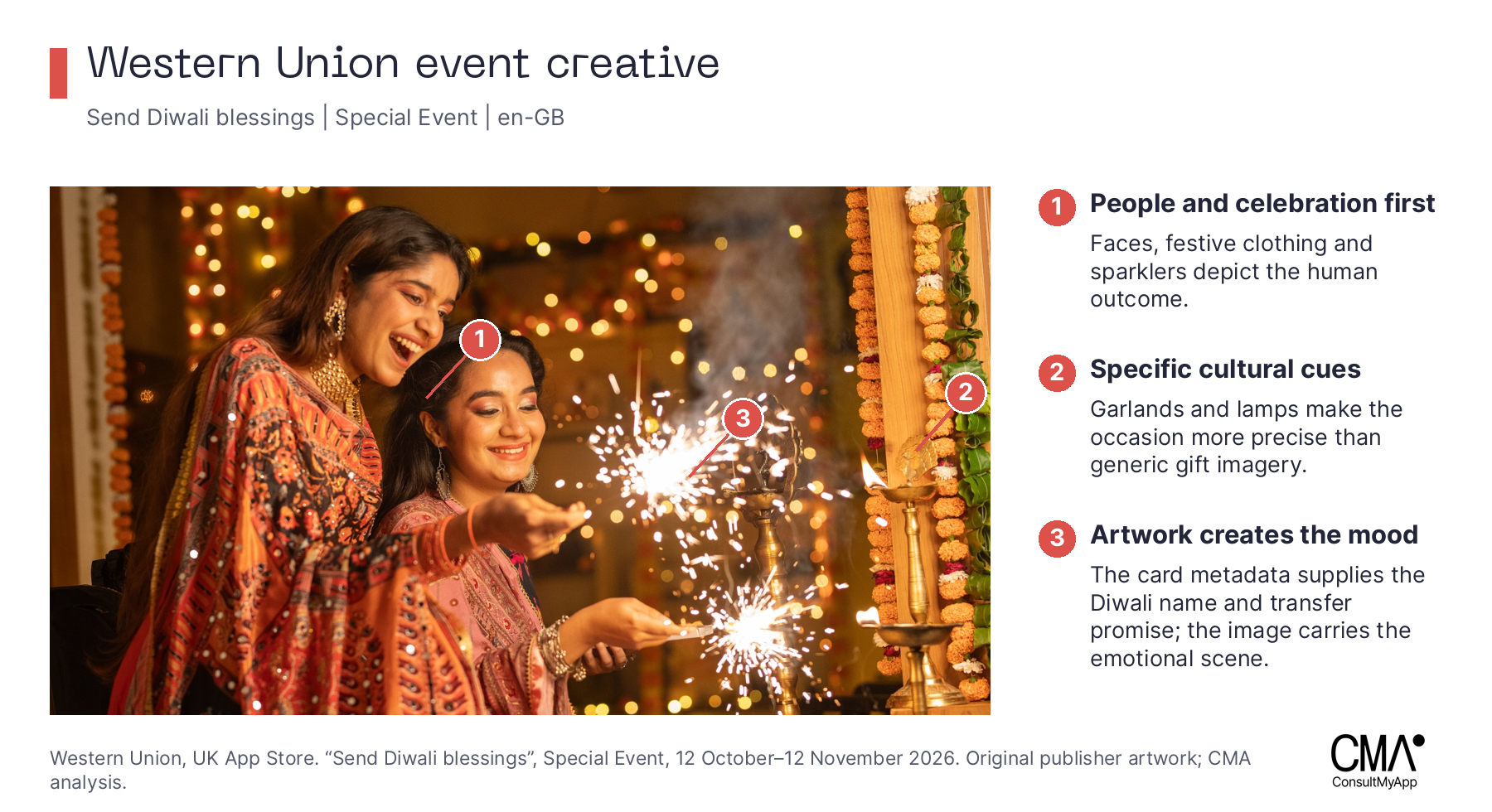
Our interpretation is that the image begins with the human occasion a transfer can support. Apply that thinking by briefing the setting and audience moment in detail, with a genuine in-app experience behind it. Compare an occasion-specific scene with a broader sending-money concept using comparable audiences and messages. Cultural specificity needs informed review, not simply a decorative festival cue.
Remitly lets the words explain the update. “Get help by chat or voice”, a UK Major Update dated 15 October to 2 November 2026, uses a smiling person on a sofa with a phone. There is no visible chat or voice-support interface. The photograph carries a relaxed everyday context while the accompanying words explain what changed.
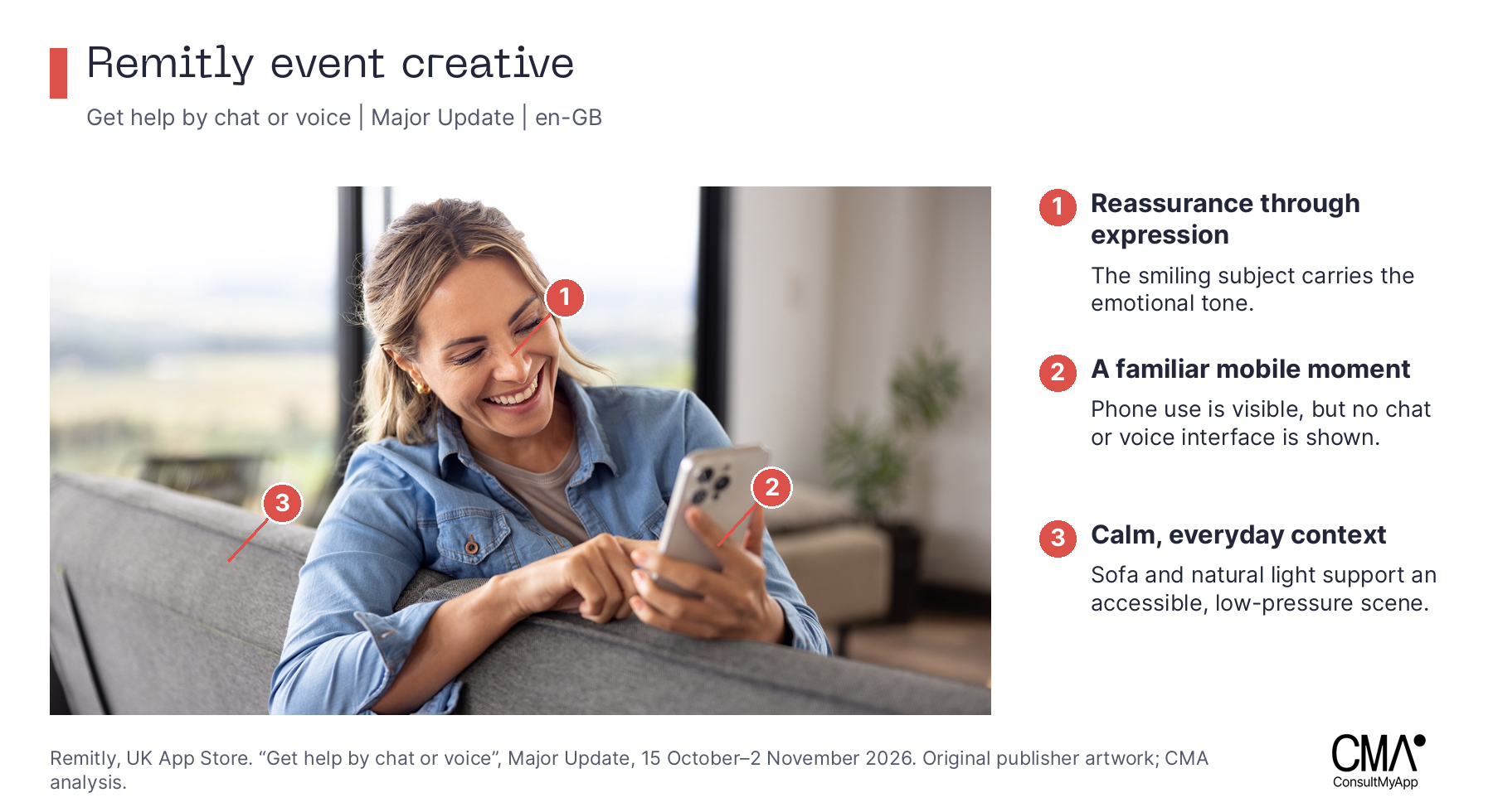
Support could be shown through a human scene, an actual interaction or a combination. For a meaningful support release, those are useful alternative concepts to explore. Keep the message stable and assess comprehension alongside the relevant downstream action. A smiling person does not substantiate a promise about service quality.
Wise makes an abstract benefit tangible. Its US event “Give them a head start.” runs from 25 September to 26 October 2026. A tight crop centres a green Wise card beside a green dessert. The physical card, hands and everyday setting make the product concrete; the event text explains the friend-invitation and card-gifting proposition.
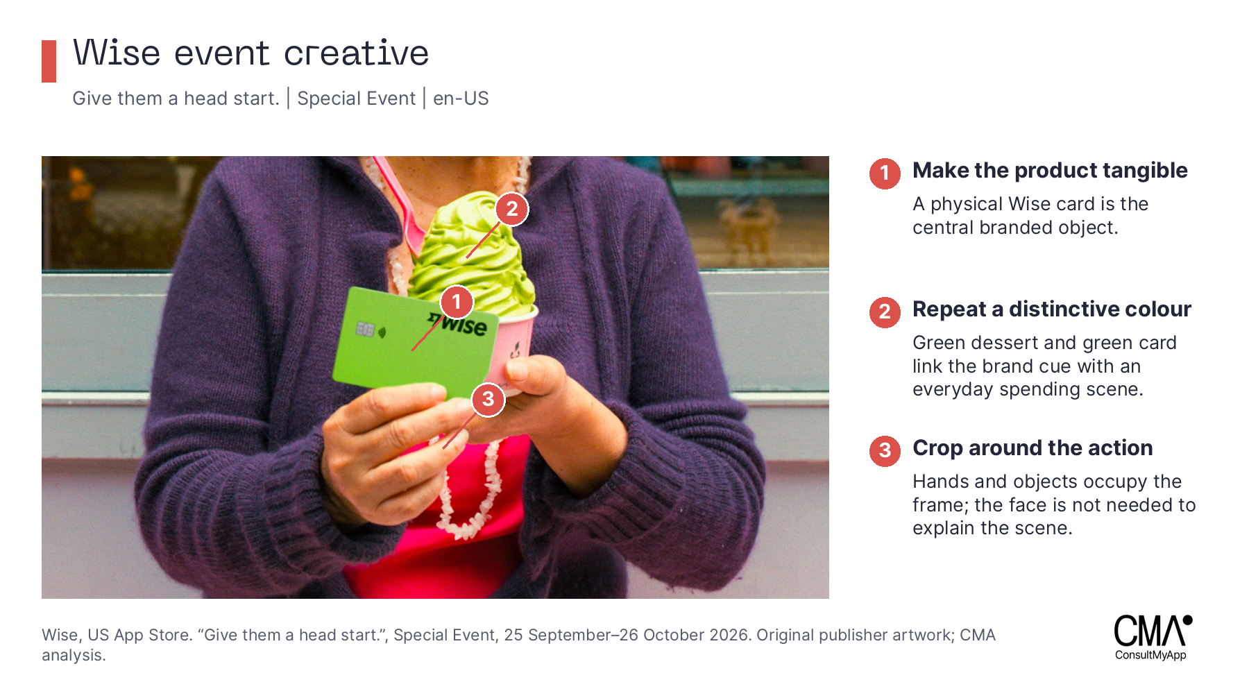
The useful question for a designer is which real object or moment makes a software benefit easier to understand. Develop a product-in-use concept alongside an interface-led concept, preserving the message and distinctive brand cues. The public execution offers a creative direction to investigate; it supplies no comparative performance result.
Taptap Send localises a recognisable character. The archived UK event “¡Viva México!” ran from 11 to 20 September 2026. Its bird mascot appears with flag-colour ribbons and a Mexican flag. The character, shape language and limited palette create continuity with the icon while the surrounding cues identify the occasion.
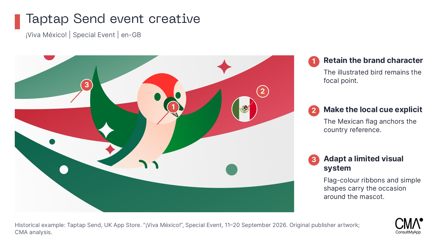
Build your own occasion system by deciding what stays fixed and what may change: character, composition, colour relationships, setting and language. Ask the intended audience whether the result feels relevant and recognisable. Use the event’s actual in-app promise as the starting point. App marketing software helps preserve the context and timing that a detached mood-board image would lose.
CPPs
Custom product pages, or CPPs, let a publisher develop a different product-page story for a particular audience or task. Apple supports alternative screenshots, promotional text and app previews, unique page URLs, use in Apple Ads and discovery through assigned search keywords. That makes CPP research relevant to both creative direction and app campaign management. See Apple’s CPP guidance.
Wise separates consumer and business tasks. The UK business CPP observed organically on 22 October leads with a global business account, followed by paying suppliers and contractors. Its default page opens with an individual transfer calculation. The green identity remains recognisable, while the opening language, account view and supporting tasks change.
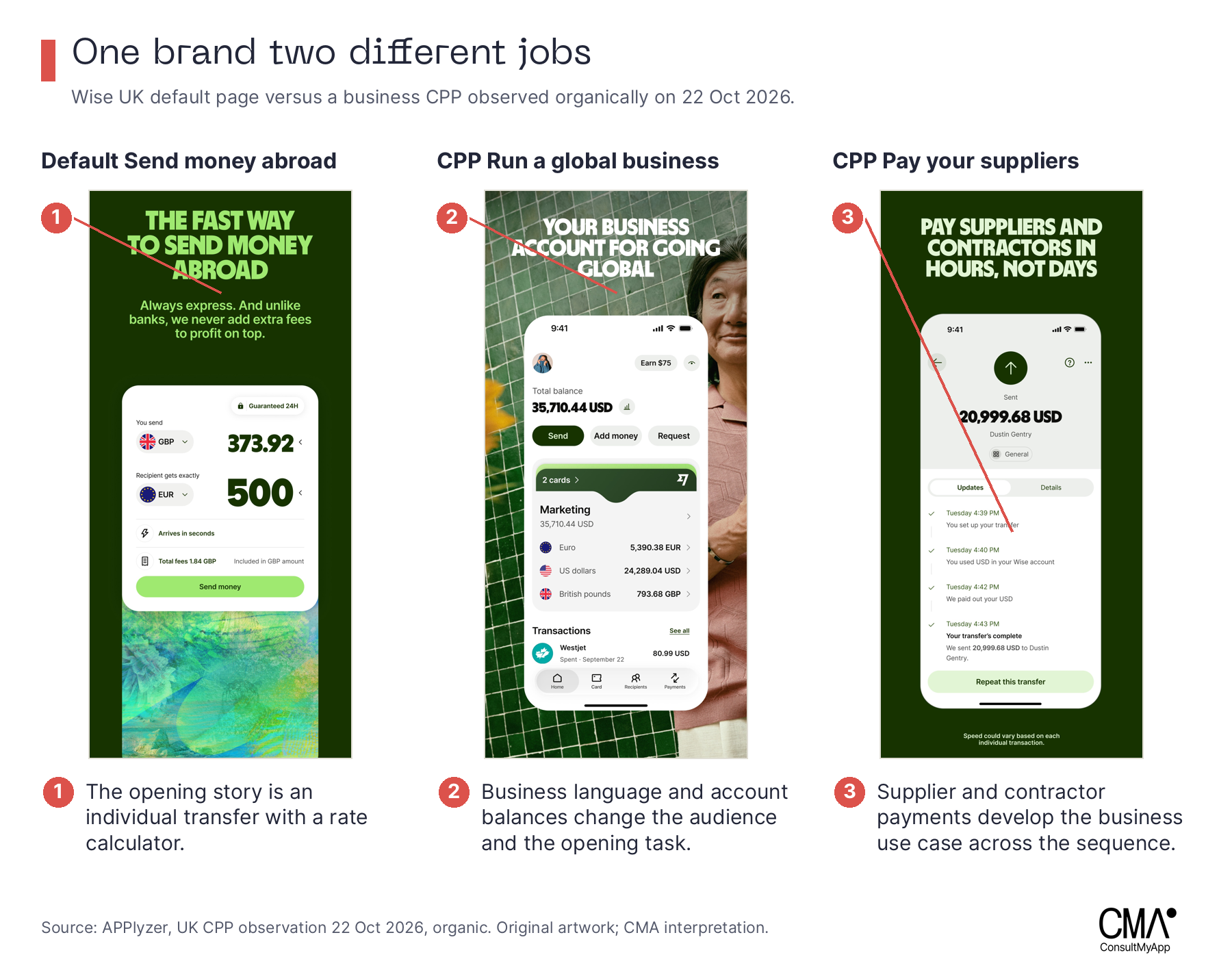
For your own app, segment the job before changing the visual style. A business payer and a person supporting family abroad may need different evidence. Brief the page as a sequence that answers the selected audience’s questions. Keep the proposition consistent with the ad or search context that sends people there.
Remitly makes a route specific. A UK paid CPP observation from 29 July 2026 shows a Philippines-led opening, then GBP-to-PHP mobile-wallet details including GCash and Maya, followed by familiar banks and cash-pickup providers. The sequence adds practical meaning to the destination: where the money goes, how it arrives and which organisations handle it.
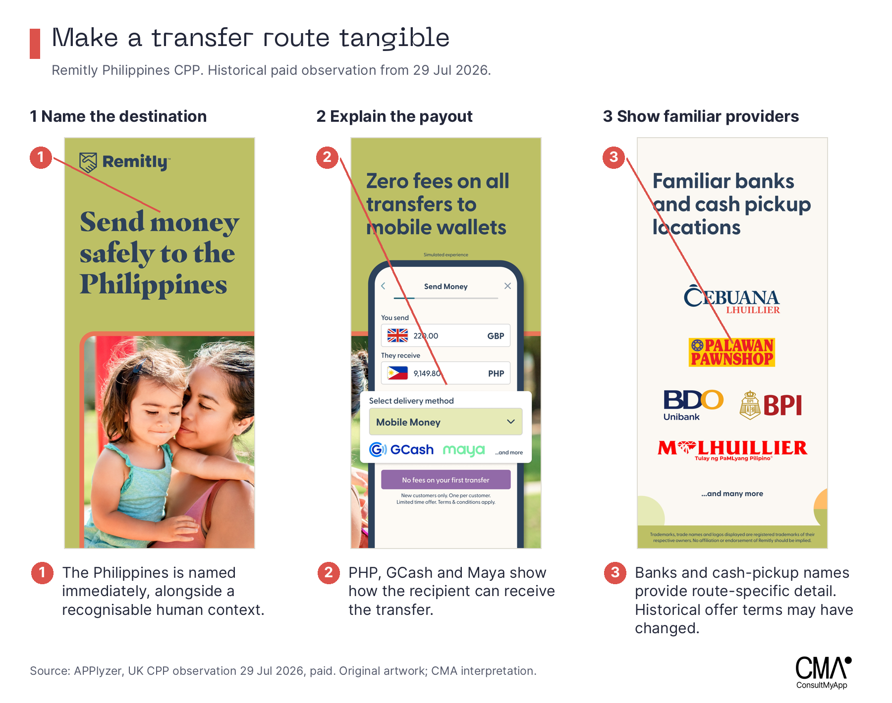
A destination page should earn its specificity. If all that changes is a flag, the reader may still lack the information needed to act. Confirm route availability and payout options, then choose the detail that resolves a real uncertainty. The research can suggest what to investigate; first-party conversion and completed-transfer data must determine whether the resulting direction works for your audience.
Western Union reframes the use case. Its TravelHack CPP, observed organically in the UK on 4 September, foregrounds access to local cash while travelling. A later frame supports paying and checking fees. Yellow and black maintain continuity with the default transfer page, while the customer task changes. APPlyzer recorded this page in an organic “wise” query observation. That is not evidence of an advertising bid on the term.
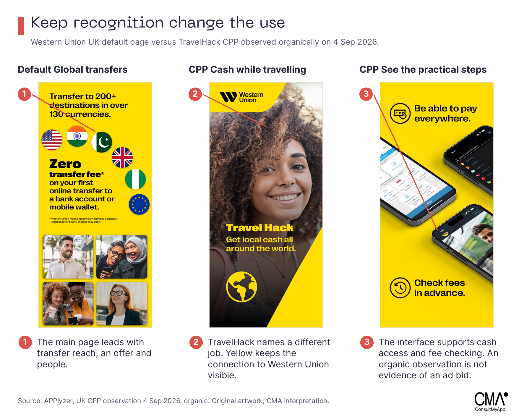
Distinguish a page’s existence from a proven creative idea. Multiple page IDs can contain the same artwork, and a historical observation may no longer represent the current campaign. Record the actual assets, page ID, date, storefront and whether the observation was organic or paid. For CPP comparisons, use appropriately controlled campaign traffic with comparable audiences, countries and periods. Where the channel supports it, split comparable traffic concurrently between pages, keep targeting and offers stable, and set the primary metric and evidence threshold before launch. Apple’s native product page optimisation tests apply to the default product page, not CPPs.
Turn research into a creative brief
The practical output of this work is a brief with an explicit decision. Choose a market and customer task, identify the competitive context, then define the one thing the creative must communicate more clearly. Preserve the source and reasoning so the designer can challenge the interpretation rather than simply imitate the reference.
| Field | Example question |
|---|---|
| Audience and task | Who is sending, from which country, to which recipient or destination? |
| Market evidence | Which relevant apps appear organically and in ads, and how large are the compared apps? |
| Creative question | Is the main uncertainty about trust, cost, speed, payout or product suitability? |
| Proposition and proof | What is the message, and which accurate UI, scene or verified claim supports it? |
| Fixed brand assets | Which colour, mark, character or typographic relationship must stay recognisable? |
| Test and decision | What will vary, which audience will see it, and what result would change the plan? |
An app creative platform is most useful when it connects market evidence, briefs, assets and test learning. App marketing software supplies the competitive context; first-party acquisition and product data establish the commercial result. The team’s role is to turn those inputs into a clear choice about the next creative direction.
Start with one priority market and one important task. Build the competitor view, write two credible creative hypotheses and test a defined difference. Keep the result with the original brief. The next round of ideation can then begin with something the team has learned about its own customers.
Explore APPlyzer app marketing software to research your priority markets, or speak to ConsultMyApp about turning the evidence into a growth and creative plan.
Methodology and sources
Organic research was retrieved on 22 October 2026 from the iPhone App Store in the UK, US and Australia. We collected 50 positions for 16 purpose-selected phrases per country: 48 country-query comparisons and 2,400 result positions. The 12-query generic panel was: money transfer; money transfer app; international money transfer; international transfer; send money; send money abroad; send money overseas; send money internationally; transfer money; transfer money abroad; transfer money overseas; remittance. Four destination queries were analysed separately: send money to india; pakistan; nigeria; philippines. They do not enter either generic-query SoV calculation.
Organic SoV is CMA’s equal-query-weighted model using 1/rank through position 50, divided by the points for every returned app in that country. Coverage is an unweighted query count. Neither is measured traffic share. Regional Western Union apps were used in each country. The sample was selected for this research and does not represent every transfer search.
Apple Ads responses were retrieved on 23 October 2026 for the same 12 generic queries in each country, with a maximum cache lookback of 168 hours. The selected 36 successful country-query responses contained 60 app appearances per country. Observed Apple Ads SoV is a brand’s returned app appearances divided by all returned appearances. Each app counts once per query; array order is not weighted. The API does not expose observation timestamps. This is a sample of advertising visibility, not account impression share, spend share, auction wins or a continuous monitoring measure.
Download estimates were retrieved on 23 October for 23 September–22 October 2026. The five-brand comparison uses 29 common reported dates, excluding the missing 3 October. Xe and WorldRemit returned no US estimates. Shares cover only the named panel and all reasons for installing each app. Missing values were never replaced with zero. The accompanying research files include available seven-brand UK and Australian estimates.
Creative assets and event metadata were retrieved on 23 October 2026. Default listings are country-specific snapshots. CPPs retain their individual observation dates and organic or paid provenance, including historical examples. IAEs are illustrative examples, not an exhaustive event count. Public creative cannot reveal internal intent, test design or performance. Original publisher artwork is reproduced for analysis; CMA annotations and interpretations are separate. The publication pack includes data tables, source URLs, retrieval records and the metric definitions.
Sources
- [1]APPlyzer original research and app marketing software
- [2]ConsultMyApp software and app growth consultancy
- [3]Apple creating your product page
- [4]Apple product page optimisation
- [5]Apple test eligibility and CPP restrictions
- [6]Apple custom product pages
- [7]Apple in-app events
- [8]Wise UK App Store listing
- [9]Revolut UK App Store listing
- [10]Remitly UK App Store listing
- [11]Xe UK App Store listing
- [12]WorldRemit UK App Store listing
- [13]Taptap Send UK App Store listing
- [14]Western Union UK App Store listing
- [15]Western Union Diwali event
- [16]Remitly chat and voice event
- [17]Wise card-gifting event
- [18]Taptap Send historical Mexico event