How Do I Make my App Store Screenshots Convert Traffic? Top Ten tips.

Your App Store and Play Store screenshots are of vital importance.
If you’re primarily an app-based business or thinking about ramping up app focus (and it’s safe to assume that’s the case - being on this blog) screenshots are the one part of the funnel every single user passes through.
All paid traffic.
Meta. TikTok. Google. Apple Search Ads.
And yes, organic too.
That means every pound you spend upstream - those expensive billboards in London, beautiful tube ads, PR features, podcasts, word-of-mouth - all of it leads to one place:
Your screenshots.
Let’s take an example: Two friends out jogging.
“Yeah, I’ve been using this health app. It’s unreal. I smashed my January goals because of it. Look at my calves” Said Friend one.
Friend two exclaims “Oh yeah you look fantastic, I’ll download the app later!”
….we arrive at “later” Friend two types your brand name into the App Store.
They already trust it.
The person with the calves did the heavy lifting in their recommendation.
Now they land on your product page.
No runners or fitness imagery of any sort?
No mention of the Unique Selling Points Friend one mentioned?
No energy?
No context?
Just abstract UI. Generic gradients. Screens that could belong to, well, anything.
“Is this even the right app?” App Store closed.
Download out the window.
If your screenshots don’t instantly confirm what they were told, the trust breaks.
If they’re weak - or worse, you don’t even know how they’re performing - you’ve built a bottleneck.
And nothing bypasses this step.
Not tube ads.
Not out-of-home.
Not the halo from digital campaigns.
Not competitor interception on Apple Search Ads.
Everything lands here.
This is where all that upstream effort either compounds - or quietly collapses.
This is where traffic decides: yes or no.
App Store Conversion Rate Optimisation is about making sure that moment works.
Below are 10 principles for doing exactly that.
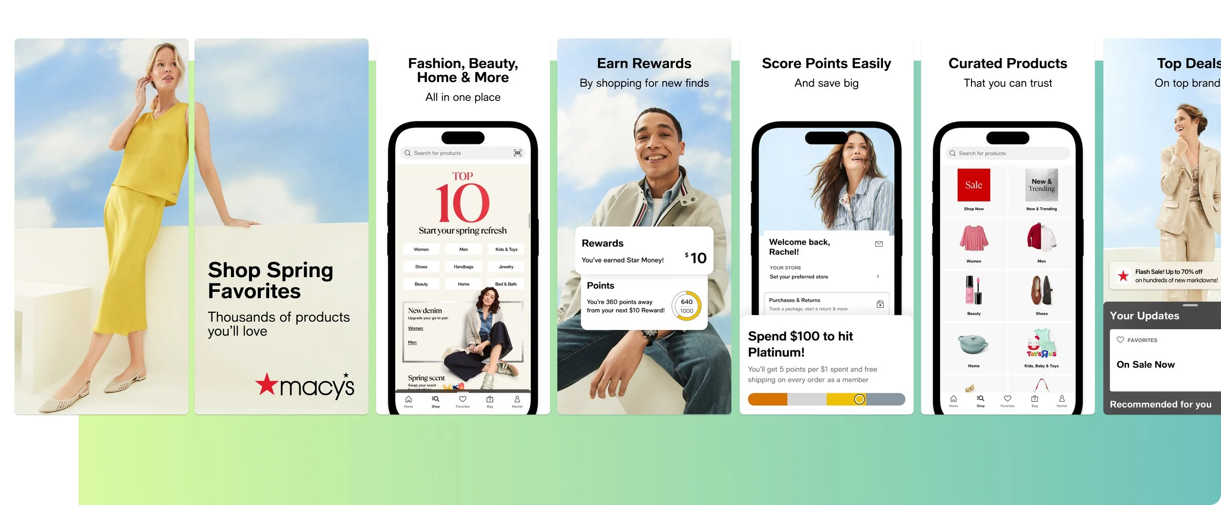
1. Your screenshots sit at the decision point of the funnel
Your screenshots are not decoration.
They are the point at which intent turns into action — or doesn’t.
By the time someone reaches your App Store listing, they are already leaning in a direction. They might be curious, comparing options, validating a choice they’ve half-made, or reacting to something they’ve seen elsewhere.
Your screenshots don’t create that intent.
They either confirm it or disrupt it.
If that confirmation doesn’t happen quickly, the decision defaults to no.
KPIs to watch
App Store conversion rate (product page views → installs)
Conversion rate split by acquisition source (paid vs organic)
If traffic is healthy but installs aren’t moving, this is where the pressure is building.
2. Your screenshots need to explain how the app works - but only as much as the category demands
Your screenshots do need to explain how the app works.
Or at least clearly allude to your USPs.
How much explanation is required depends entirely on what the user already understands when they arrive.
In retail, explanation is light. Users already know the flow. Browse, add to basket, checkout, delivery. The screenshots don’t need to teach behaviour — they need to reassure around range, value, speed, trust, and brand.
That changes the moment the app does something genuinely different.
In travel with a unique use case.
In dating with a new mechanic.
In fintech with a novel way of managing money.
In those cases, explanation becomes part of conversion. Without it, uncertainty creeps in — and uncertainty stalls action.
The job isn’t to explain everything.
It’s to calibrate explanation to familiarity.
KPIs to watch
Conversion rate by keyword intent (category vs feature-led searches)
CVR changes after adding or removing explanatory screenshots
When conversion rises after explanation is added, clarity was missing.
When it rises after explanation is stripped back, familiarity was already doing the work.
3. Relevance must come before explanation - not instead of it
Explanation isn’t the enemy.
Bad sequencing is.
If relevance hasn’t been established yet, explanation feels like effort. Once relevance is clear, explanation feels helpful.
That’s the difference.
In familiar categories, relevance is assumed. You can move quickly into benefits and reassurance (an example of reassurance being what we call social proofing: “Enjoyed my 2 Million Joggers”, if we take the aforementioned example).
In unfamiliar ones, relevance has to be constructed — which often means explaining the core mechanic earlier.
You’re not choosing between explanation and persuasion.
You’re choosing the order.
KPIs to watch
CVR changes when explanatory screenshots move earlier or later in the set
Product Page Optimisation test results where only screenshot order changes
If moving explanation earlier improves conversion, the issue wasn’t over-explaining — it was under-contextualising.
4. The first three screenshot sets expectation for everything that follows
You’ll want to tell a story across your full set of screenshots that encourages that scroll.
But that only works if the first frames earn the right to be seen.
The first three screenshots set expectation. They signals what kind of app this is, who it’s for, and why it’s relevant to the reason the user arrived.
If that frame is vague, brand-heavy, or trying to say too much, the rest of the set doesn’t matter.
KPIs to watch
Overall CVR before vs after screenshot reorder tests
CVR uplift in PPO tests where only the first screenshot changes
If conversion moves when only screenshot one changes, hierarchy — not design quality — was the constraint.
5. Keywords should shape your screenshots, not just your metadata
Keywords don’t just tell the store where to rank you.
They tell you what the user expects to see.
If someone searches “sleep tracker”, they’re already picturing outcomes, night-time context, calm framing.
If they search “budget planner”, they expect control, numbers, clarity.
If they search a competitor, they expect comparison — even if it’s implicit.
Your screenshots should visually complete that expectation.
If they don’t, you force the user to mentally translate. Most won’t.
KPIs to watch
Conversion rate by keyword cluster
CVR changes when screenshots update without metadata changes
When conversion improves without ranking movement, creative alignment is the reason.
6. Organic Custom Product Pages let you explain selectively, not globally
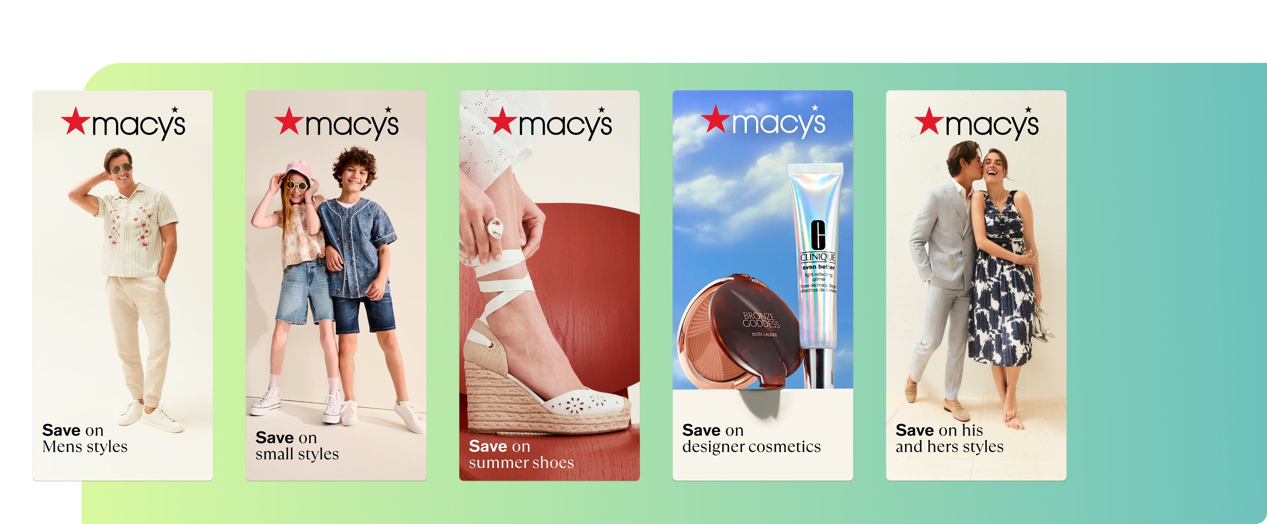
Macy’s Organic Custom Product Pages matching relevant keywords.
Organic Custom Product Pages exist so you don’t have to explain everything to everyone.
They let you show:
Less explanation where familiarity exists
More explanation where novelty exists
Different framing where intent changes
Each CPP should answer one clear question:
“Is this relevant to what I just searched?”
Nothing more.
KPIs to watch
CVR per CPP vs default product page
Install volume driven by organic CPPs
Keyword ranking stability after CPP assignment
If a CPP lifts conversion without destabilising rankings, it’s doing exactly what it should.
7. On Google Play, Custom Store Listings accelerate the same logic
Custom Store Listings allow the same intent alignment on Google Play, often with faster decision cycles.
That speed raises the cost of confusion.
You don’t get many seconds to orient the user. If explanation is needed, it has to be immediate and obvious. If it isn’t, it has to get out of the way.
KPIs to watch
Install rate per Custom Store Listing
Conversion rate by acquisition source
When one CSL materially outperforms another, relevance — not creative polish — is the driver.
8. AI is most useful for spotting where clarity breaks down
AI shouldn’t add value just by generating screenshot copy, in fact, it can do a whole lot more than that. Using APPlyzer 26, you can easily spot high-value keywords that you are ranking for, which should indicate what basket to put your eggs in (in regard to screenshot design).
For example, if you are an iGaming app, and rank highly for the term “blackjack”, and it has a decent search score and download estimates attached (to be found in APPlyzer also) you’ll want an organic custom product page and custom store listing - to match that intent.
AI should really add value by showing you:
Keywords with strong demand but weak conversion
Searches where users hesitate despite relevance
Competitors weak spots you can capitalise on
It highlights where understanding is missing or excessive.
You still decide how to fix it.
KPIs to watch
CVR uplift after intent-specific explanation changes
Reduction in paid dependency for the same keywords
When clarity improves, efficiency follows, downloads roll in, and ultimately that bottom line starts to curve upwards.
9. Explanation should reduce perceived effort, not increase it
The goal of explanation isn’t education.
It’s reassurance.
Screenshots should make the app feel:
Easier
Clearer
More obvious
Less risky
If explanation introduces cognitive load, conversion drops.
If it removes uncertainty, conversion rises.
KPIs to watch
CVR changes after simplifying explanatory copy
CVR differences between category-level and exploratory keywords
If exploratory traffic converts better after clarification, explanation is earning its place.
10. Screenshot performance directly affects CPI - whether you measure it or not
Screenshots don’t sit downstream of acquisition.
They feed back into it.
When conversion drops, CPI rises.
When conversion improves, paid efficiency improves automatically.
This is why CRO isn’t cosmetic.
It’s economic.
Core KPIs to review regularly
Overall App Store conversion rate
CVR by keyword intent
CVR by CPP / CSL
CPI before vs after screenshot changes
When screenshots work harder, everything upstream gets cheaper.
Final word
Screenshot strategy, can often be an afterthought in app marketing. But, as illustrated, it really shouldn’t be. Conversion Rate Optimization of your full set of screenshots within the App Store, and Google Play store, again, is of vital importance if you want to pick up momentum in downloads, and learn about your users whilst you do it.
Screenshots exist to push all your traffic towards downloading. Not to create a bottleneck that prevents it.
Sometimes that means reassurance.
Sometimes that means differentiation.
Sometimes that means orientation.
The job is to figure out exactly, what the optimal set is, and right quick. Otherwise, downloads are left on the table.
You can see some of our previous work on screenshot strategy (with results, of course) right here.